The Shadow DOM is a technique for creating and using isolated, reusable parts of a web page’s structure and styling.
Introduction
The Shadow DOM allows developers to encapsulate the structure and styling of a particular element or component so that it can be easily reused and integrated with other parts of a web page without the risk of conflicting with other elements or styles.
The Shadow DOM is a crucial feature of modern web development. It helps make web pages more modular and maintainable by allowing developers to break them down into smaller, self-contained components.
It is especially useful for building large, complex web applications that require a high degree of modularity and reuse.
What is the DOM?
To understand the Shadow DOM, it is helpful first to understand the concept of the DOM, or the Document Object Model.
The DOM is a tree-like representation of a web page’s structure, with each page element represented as a node in the tree. The DOM allows developers to manipulate the structure of a web page by adding, deleting, or modifying nodes in the tree.
One of the main challenges of working with the DOM is that it can be difficult to manage the styling and layout of elements within the DOM, especially when multiple developers are working on the same page.
This is because the DOM is a global entity, meaning that all elements within it are accessible to any part of the page and can potentially conflict with each other.
What is the Shadow DOM used for?
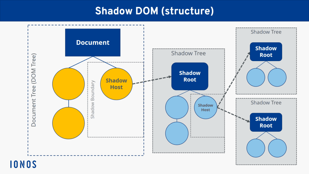
The Shadow DOM addresses this issue by allowing developers to create “shadow” DOM trees that are separate from the main DOM.
These shadow DOM trees are attached to a particular element within the main DOM, and any changes made to the shadow DOM are isolated from the rest of the page.
This means that developers can style and layout elements within the shadow DOM without worrying about conflicting with other elements or styles on the page.
Benefits of using the Shadow DOM
One of the main benefits of the Shadow DOM is that it allows developers to create reusable components that can be easily integrated into any web page.
For example, consider a developer who wants to create a custom button component with a distinct look and feel.
With the Shadow DOM, however, the developer can create the button component as a standalone element with its own shadow DOM tree, otherwise, he/she would have to copy the HTML, and JavaScript required wherever they were to use this button.
This tree can contain all the HTML and CSS needed to style the button and any JavaScript code required to make the button functional.
The developer can then use this component on any page simply by adding a reference to the component’s HTML file.
Example
Here is an example of how to create a simple button component using the Shadow DOM:
First, we define the HTML template for the component:
<template id="button-template">
  <style>
    /* CSS styles for the button */
    button {
      background-color: blue;
      color: white;
      border: none;
      padding: 10px 20px;
      font-size: 16px;
    }
  </style>

  <button>Click me</button>
</template>
Next, we create a JavaScript class for the component:
class ButtonComponent extends HTMLElement {
  constructor() {
    super();

    // Create a shadow root for the component
    this.attachShadow({mode: 'open'});

    // Import the HTML template for the component
    const template = document.querySelector('#button-template');

    const templateContent = template.content;

    // Add the template content to the shadow root
    this.shadowRoot.appendChild(templateContent.cloneNode(true));

    // Add an event listener for the button
    this.shadowRoot.querySelector('button').addEventListener('click', () => {
     console.log('Button was clicked');
   });
  }
}

// Define the custom element customElements.define('custom-button', ButtonComponent);
Finally, we can use the component on any page by simply adding a reference to the component’s HTML file and using the <custom-button> element:
<!-- Include the component's HTML file -->

<link rel="import" href="/path/to/button-component.html">

<!-- Use the component in the page -->

<custom-button>This is my fancy button's text</custom-button>
This is a basic example of using the Shadow DOM to create a reusable component. In practice, you can use the Shadow DOM to create more complex and sophisticated components that include multiple elements, styles, and functionality.
Keep in mind
There are a few important things to remember when using the Shadow DOM:
- It’s not supported in all browsers, so you may need to use polyfills or other techniques to ensure that your components work across all platforms.
- Is designed to be used with custom elements, a new feature of HTML5 that allows developers to create their own custom HTML tags.
- Is intended to be used for styling and layout purposes and is NOT intended to be used for data binding or other types of functional logic.
Summary
Overall, the Shadow DOM is a powerful tool for building modular, reusable components for web applications.
Encapsulating the structure and styling of a particular element or component allows developers to create self-contained, easily maintainable pieces of a web page that can be easily integrated into any page.
I hope you’ve enjoyed the read, and it helped you gain some insight into what the Shadow DOM is, as well as why you should consider it when working with vanilla HTML/CSS.
Feel free to leave feedback on this article in the comments section below.
Cheers!
💬 Leave a comment