As part of a recent build of mine, I added the website to Google Webmaster Tools. Now, among other things, these tools provide insight into how Google sees your website functioning, and also gives feedback on any issues it found while crawling your pages.
A big focus for Google in the past 10 years, has been how websites function on mobile. Do they load in a reasonable time? Does the javascript require a huge amount of resources that makes your phone too hot to handle? And more recently, does your website function in a way that’s easy to use on a mobile touch screen?
That last point is frankly, a little subjective, but it’s one that Google is taking a keen eye on. And when you fail their test, you get a rather vague message of “Clickable elements too close together”. I actually searched the web for any tool that could actually pinpoint what exactly on my website was causing the issue, but to no avail. So unfortunately, there is a bit of trial and error involved. But you can speed up that trial and error by knowing where to look.
Element Size And Margin – The Key Culprits
Almost universally, you’re going to run into this problem when a clickable element is either too small, or it’s too close to another element that is also clickable. An example I will show you shortly was that I had a button that opened the side menu right up against a link that takes you back to the homepage. The button itself was too small, but additionally, the fact that there was no gap between the two items was also a mobile usability problem.
I hunted around for the exact numbers that I should be aiming for, and there seemed to be a little bit of a consensus on the following :
- Any element that is clickable (That is not a text link) should be at least 48x48px (e.g. Buttons, images, SVGs etc)
- Any element that is clickable should have at least 8px margin on all sides from any other clickable element
These are your starting points, so if you can look at your website right now and immediately identify problems with the above, then you are good to go! Start making changes and testing those updates using the steps below.
Finding Clickable Elements
One way to help you diagnose any mobile element problem is to add an outline to any element that is clickable. For that, you can use the following CSS :
a, input, button, svg {
    outline: 1px solid red;
}
Note that I’ve put SVG in there for my own needs (Since I have clickable SVG’s on my site), but should you not, then you can remove it. By the same token, if you have clickable elements that you want to check if they overlap, then be sure to add them.
You can either add this CSS in development *or* you can use something like Chrome Dev Tools to see things on the fly.
In my particular case, I ended up with a view like this :
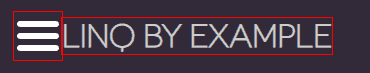
Clearly now I can see that these elements are too close together and are actually overlapping somewhat. Using this visual tool, we can easily identify elements that don’t have the appropriate margin, and easily rectify them.
Every Element Is Tested
Something that caught me out is that elements I thought would be “invisible” to Google were in fact causing problems. This included a slide out menu that is only shown on mobile, and an iframe to another site. I figured that in the iframe’s case, I would not be penalised since I didn’t even think Google would bother loading the iframe in any testing tool. I was wrong, very very wrong!
This may be obvious, but just in case it isn’t, don’t assume something is not relevant to what Google is testing. If it’s on the page, or it’s reachable in some way, it could be causing the error.
Testing Changes
The easiest way to test if your changes have fixed the problem is to go to Google’s official tool at : https://search.google.com/test/mobile-friendly. I’ll be the first to admit that this tool can be a bit finicky and it sometimes takes a few changes to finally get your website the green light. Elements that I thought would be causing issues, actually were fine, and it was other inconspicious items that were doing all the damage. The trick is, just keep adding margins and testing your changes until you get it right.
If you are having to make large scale UI changes that you aren’t happy with, you still want to get to the point where Google is liking your page, and then you can start rolling back changes one by one, to see which changes actually had an affect. Again, it’s painful because Google will not tell you exactly which elements are causing problems, so trial and error is really your only way.
💬 Leave a comment