Sometimes, we need to draw the user’s attention to a specific part of our website, for example, we can draw our user’s attention to a popup or an error. At these times, I generally prefer to apply a half-transparent black background behind the thing I want to focus on. Let’s make an example with a popup.
Create a react app with create-react-app and jump right into the src folder. Create a Popup.js file under src:
src/Popup.js
import React from 'react';
import styled from 'styled-components'

const Popup = () => {
    return (
        <PopupWrapper>
            <PopupTitle>Welcome to our website</PopupTitle>
            <div>
                Upmostly is a great website to help you to learn React and Javascript.
            </div>
        </PopupWrapper>
    )
}
const PopupWrapper = styled.div`
border-radius:1rem;
border:2px solid black;
padding:1rem;
background-color:white;
display:flex;
flex-flow:column nowrap;
align-items:center;
justify-content:space-evenly;
width:20rem;
height:10rem;
position:absolute;
top:calc(50% - 10rem);
right:calc(50% - 10rem);
z-index:10;
`
const PopupTitle = styled.div`
font-size:1.25rem;
font-weight:bold;
margin-bottom:1rem;
`

export default Popup;
Note: Attention on z-index:10 on PopupWrapper. We need this because we want our popup to be shown at the top.
Note: I’ll use styled components for styling in this article, to learn more about styled components, check out this article:
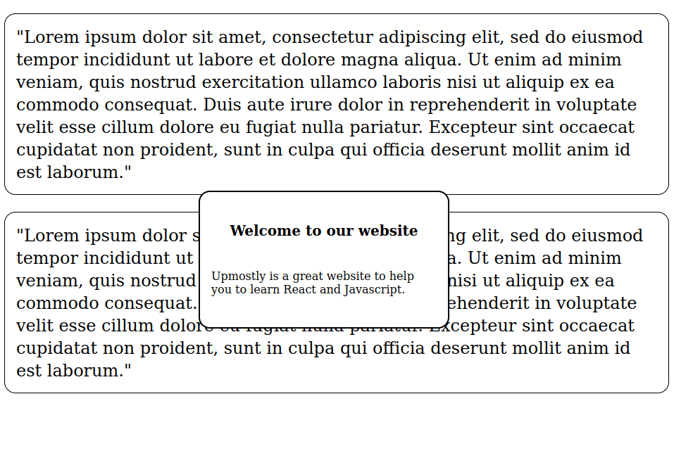
Right now we have our basic popup ready. If we put it on an empty page, the user will definitely focus on it since there’s nothing else. But what if we need to put it into a page that has lots of other things on it?
Let’s create a page with lots of things on it. Jump into App.js and modify it like this:
src/App.js
import React from 'react';
import Popup from './Popup';
import styled from 'styled-components';
const App = () => {
  return (
    <>
      <StyledParagraph>
        "Lorem ipsum dolor sit amet...."
      </StyledParagraph>
      <StyledParagraph>
        "Lorem ipsum dolor sit amet...."
      </StyledParagraph>

      <Popup />
    </>

  )
}
const StyledParagraph = styled.p`
padding:1rem;
border:1px solid black;
border-radius:1rem;
line-height:2rem;
font-size:1.5rem;
`
export default App;
And the output will look like this:
As you can see, it’s not very easy to focus on our popup. Let’s modify the App.js like below and see how to draw users’ focus into our popup.
src/App.js
.
..
      <PopupBackground />
      <Popup />
    </>

  )
}
const PopupBackground = styled.div`
width:100vw;
height:100vh;
background-color:black;
opacity:0.9;
position:absolute;
top:0;
z-index:5;

`
.
..
const StyledParagraph = styled.p`
..
.
We added a PopupBackground styled component.
And the output is:
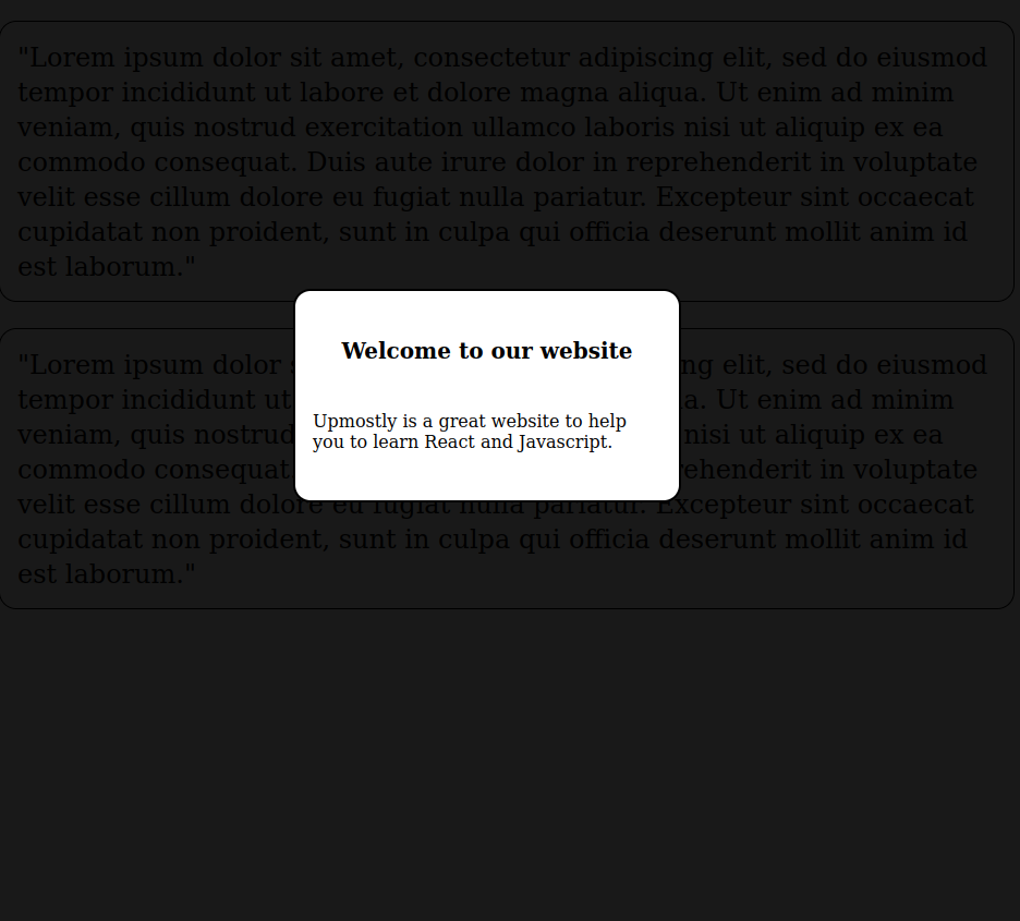
As you can see, we’ve successfully drawn our users’ attention to our popup.
Summary:
The tactic is to create a background with a lower z-index than the thing you want to focus on.
And this is all I have for this article. I hope you enjoyed and learned a lot.
💬 Leave a comment