Modals are a very useful piece of UI, used to display separate pieces of information, like dialog boxes. You can implement modals very easily in React, thanks to some useful patterns, like the state hooks, and the context API. In this article, I’ll talk you through building a basic, but very extensible modal system.
Here’s what our end result will look like:
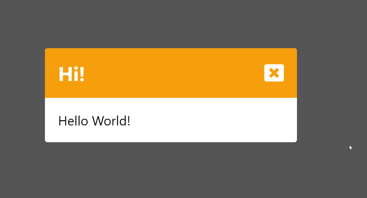
Now let’s go through building this, step by step.
Modal
Here’s the plain component for our Modal, without any logic.
function Modal({ title, content, level }: ModalProps) {
    const colours = {
        'info': 'bg-green-500',
        'warning': 'bg-amber-500',
        'error': 'bg-red-500'
    } satisfies Record<ModalProps['level'], string>;
    return (
        <motion.div
            className="absolute top-0 flex h-screen w-full items-center justify-center overflow-clip bg-[#000000AA]">
            <motion.div
                className="relative rounded bg-white shadow w-96">
                <div className={clsx("flex w-full rounded-t px-5 font-bold py-5 items-center justify-between text-3xl text-white", colours[level])}>
                    <div>{title}</div>
                    <button>
                        <FaWindowClose />
                    </button>
                </div>
                <div className="px-5 py-5 text-xl">
                    <div>{content}</div>
                </div>
            </motion.div>
        </motion.div>
    );
}
I’m filling the screen with a div, using position absolute to move it out of the flow of the rest of the page, and just place it above everything. I’m using TailwindCSS for the styling, which you can see in the class names. Then I’ve just created a simple modal inside our full-screen div, which will be our actual modal box.
Our props look like this:
type ModalProps = {
    title: string;
    content: string;
    level: 'info' | 'warning' | 'error';
};
A title and content, as well as a string to decide the colour/variant of our modal box.
Without any of the logic, this is what we get:
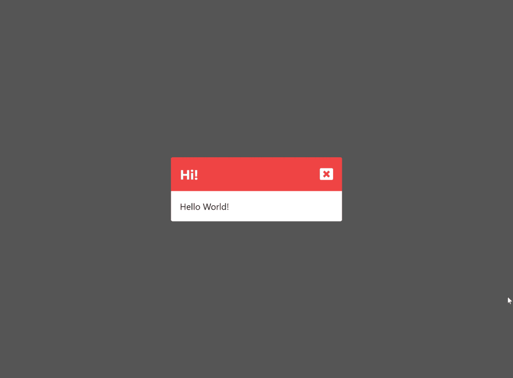
Looks great, but it doesn’t do anything. We need some way to open and close the modal.
Context
I’ll be using the Context API for this. Context lets you store any value in a context, and then create a context provider component. Inside the context provider component, any child can access the context value without needing to pass it through any parents. You can read more about the Context API here. In this small example, there isn’t much difference, but in a larger app, this would be useful to be able to open our modal from anywhere.
Here’s our context:
const ModalContext = createContext<
    [(modal: ModalProps) => unknown, () => unknown]
>([() => console.log('Open modal'), () => console.log('Close modal')]);
This might look a little confusing, but we’re just storing two functions, one to open the modal, and one to close the modal. I’ve given them both default values which are functions that don’t actually do anything, they just print some text.
Then to create and provide our context:
export function ModalContextProvider({ children }: WithChildrenProps) {
    const [modal, setModal] = useState<ModalProps | undefined>();

    const openModal = (modalProps: ModalProps) => setModal(modalProps);
    const closeModal = () => setModal(undefined);

    return (
        <ModalContext.Provider value={[openModal, closeModal]}>
            {children}
            <AnimatePresence>
                {modal && <Modal key="modal" {...modal} />}
            </AnimatePresence>
        </ModalContext.Provider>
    );
}
Here’s the actual logic for our modals. If we have a modal, it gets stored in state and rendered, if we don’t and it’s undefined, nothing gets rendered.
Page Component
export default function ModalPage() {
    const [openModal, closeModal] = useContext(ModalContext);
    const randomLevel = () => ['info', 'warning', 'error'][Math.floor(Math.random()*3)]
    return (
        <div className="flex h-screen w-full items-center justify-center">
            <button
                onClick={() =>
                    openModal({
                        title: 'Hi!',
                        content: 'Hello World!',
                        level: randomLevel(),
                    } as ModalProps)
                }>
                Open Modal
            </button>
        </div>
    );
}
Thanks to our context, we can really easily access the functions to open and close our modal. I’ve just created a simple page with a button to open a modal with a random level.
Adding Some Animation
At the moment, our modals just pop in and out instantly. I’m going to add some animation using Framer Motion, a great library for adding animation to React apps.
You might notice our modal was wrapped in an <AnimatePresence> element. This lets Framer Motion track when components pop in and out of the component tree.
Then we can define “variants”, or sets of styling to apply to our component:
const ModalBgVariants: Variants = {
    hidden: { opacity: 0},
    show: { opacity: 1, transition: { delayChildren: 0.1 } },
};

const ModalBoxVariants: Variants = {
    hidden: { opacity: 0, y: '60vh' },
    show: { opacity: 1, y: 0 },
};
Our background is transparent when the variant is hidden, and not transparent when it’s set to show. Our box is the same, but I’m also adding a y offset when it’s hidden, to make it slide in. All I need to do to tell Framer Motion when to use these is add them to our modal component:
function Modal({ title, content, level }: ModalProps) {
   ...
    return (
<motion.div
            className="absolute top-0 flex h-screen w-full items-center justify-center overflow-clip bg-[#000000AA]"
            initial="hidden"
            animate="show"
            exit="hidden"
            variants={ModalBgVariants}>
            <motion.div
                className="relative rounded bg-white shadow w-96"
                variants={ModalBoxVariants}>
...
        </motion.div>
    );
}
And here’s our animation:
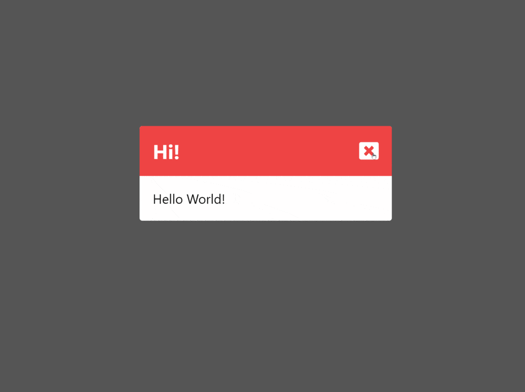
Slick animations, without much work!
Thanks for reading this article. Feel free to use this component and expand it for you own uses. If you liked this article, or if you’re having any troubles, feel free to leave a comment below.
Comments
Good day, is there a git repo for the modal implementation please.
Regards