Framer Motion is a powerful animation library that makes it easy to create smooth, complex animations in your Next.js projects. In this article, we will explore the benefits of using Framer Motion in a Next.js project. By combining the two, you can create highly interactive and visually appealing Next.js applications with minimal effort. Let’s walk through the process of integrating Framer Motion into a Next.js project, and demonstrate some of the key features and capabilities of the library.
Getting Started
First, let’s add Framer Motion to our Next.js app with:
npm install --save framer-motionBuilding our Dashboard
Menu
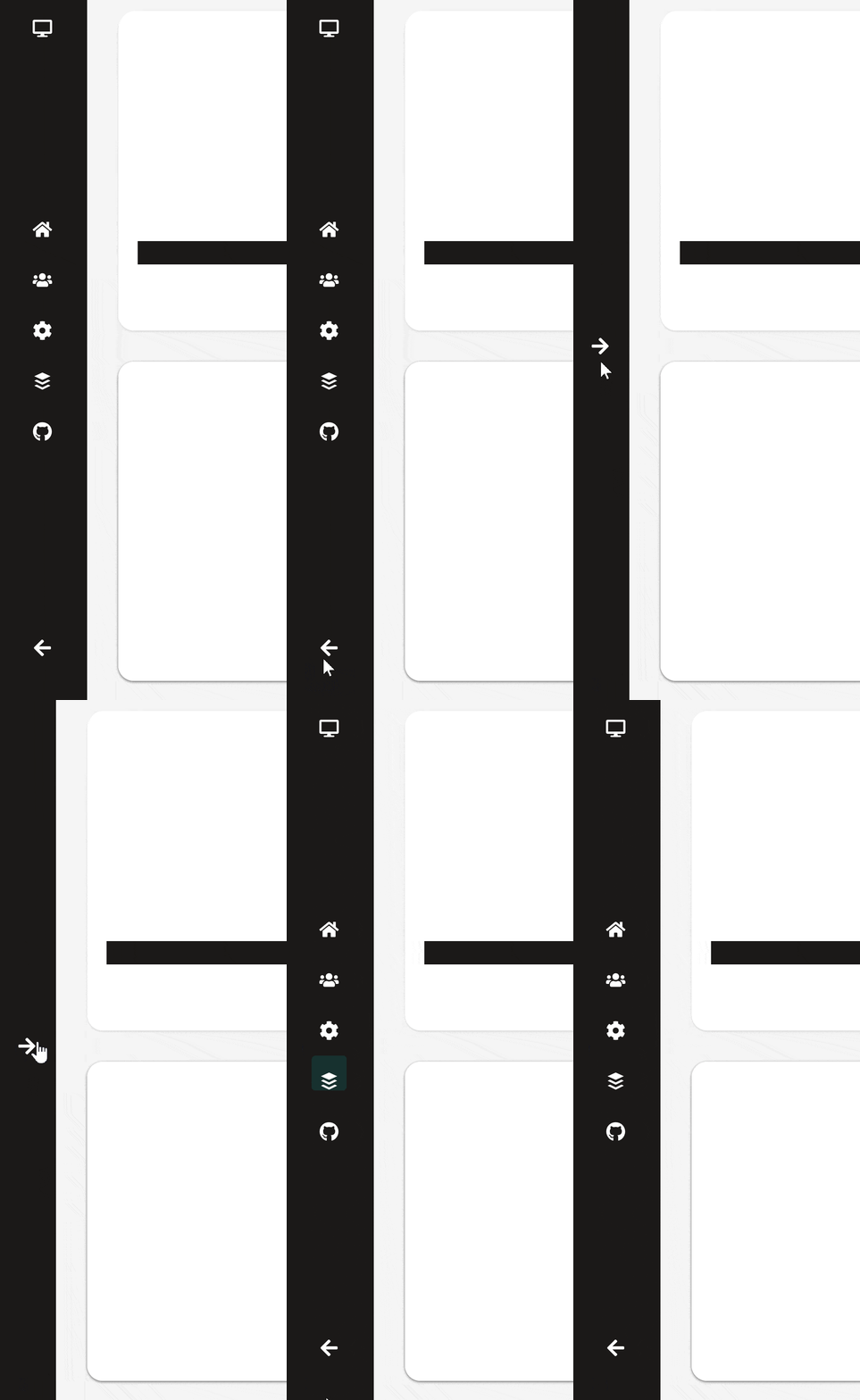
I’ve created a menu with a simple button to slide the menu in and out. This works fine without Framer Motion, but let’s add in some animation to transition between open and closed.

Here’s the code for our menu:
export function Menu() {
    const [open, setOpen] = useState(true);

    useEffect(() => {
        console.log(open);
    }, [open]);

    return (
        <motion.nav
            className="flex h-full flex-row items-center justify-between gap-4 bg-stone-900 py-10 px-5 text-3xl text-white"
            layout>
            <AnimatePresence mode="popLayout">
                {open ? (
                    <MenuOpen setOpen={setOpen} />
                ) : (
                    <MenuClose setOpen={setOpen} />
                )}
            </AnimatePresence>
        </motion.nav>
    );
}
All we have is a simple component that uses conditional rendering to toggle between two components, so how is our animation working?
This is all thanks to Framer Motion’s AnimatePresence component, which detects when its direct children enter/exit. If these children contain enter/exit animations, Framer Motion then triggers them.
So how do animations work in Framer Motion?
Let’s take a look at the code for the closed menu:
function MenuClose({
    setOpen,
}: {
    setOpen: Dispatch<SetStateAction<boolean>>;
}) {
    return (
        <motion.div
            key="empty-menu"
            className="flex h-full items-center justify-center"
            variants={MenuItemVariants}
            initial="hide"
            animate="show">
            <button className="text-xl" onClick={() => setOpen(true)}>
                <FaArrowRight />
            </button>
        </motion.div>
    );
}
Framer motion contains custom versions of HTML elements, prefixed by “motion”. These versions give you access to all of Framer Motion’s functionality and are optimised for animation.
Framer motion lets you define preset animations, called variants. Here are the variants for our component:
const MenuItemVariants: Variants = {
    hide: { opacity: 0 },
    show: { opacity: 1 },
};
These variants let you customise and animate to nearly any CSS property, but here we’re just making our items fade in and out when they enter/exit.
Then in order to animate our menu changing size, we use the “layout” prop, which you may have noticed above:
export function Menu() {
...
    return (
        <motion.nav

            layout>
This tells our code to watch for layout changes, such as size changes in our component, and animate to them.
Menu Icons
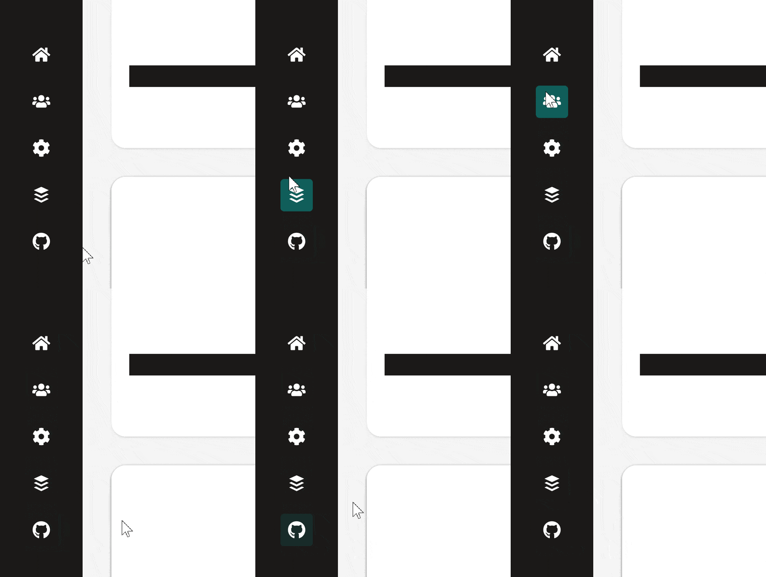
I’ve also added in a hover animation for our menu icons:

This one is a little more complex, combining Next.js and Framer Motion features. Here’s our menu component:
function MenuOpen({ setOpen }: { setOpen: Dispatch<SetStateAction<boolean>> }) {
    const [social, setSocial] = useState<number | null>(null);
    const icons = [FaHome, FaUsers, FaCog, FaBuffer, FaGithub];
    return (
        <motion.div
            key="menu-icons"
            className="flex h-full w-full flex-col items-center justify-between"
            variants={MenuItemVariants}
            initial="hide"
            animate="show">
            <FaDesktop className="text-xl" />
            <menu
                className="flex flex-col items-center justify-center gap-4 text-3xl text-white"
                onMouseLeave={() => setSocial(null)}>
                {icons.map((Icon, i) => (
                    <AnimatedIconLink
                        index={i}
                        key={i}
                        currentIndex={social}
                        onEnter={setSocial}>
                        <Icon />
                    </AnimatedIconLink>
                ))}
            </menu>
            <button className="p-4 text-xl" onClick={() => setOpen(false)}>
                <FaArrowLeft />
            </button>
        </motion.div>
    );
}
You can ignore most of the code here, the key part is our list of AnimatedIcons. I’m tracking which icon is currently hovered over using a useState hook, storing the index of the icon. Inside this component we handle leaving the component entirely, in which case none of the icons should have a background. Then we pass into each AnimatedIcon an index, the current index we’re hovering over, as well as a function to call when we do hover over it.
Drilling into that component we have:
export function AnimatedIconLink({
    children,
    currentIndex,
    index,
    onEnter,
}: AnimatedIconLinkProps) {
    return (
        <li
            onMouseEnter={() => onEnter(index)}
            key={index}
            className="relative flex items-center justify-center overflow-visible rounded p-2 text-xl transition-all">
            <AnimatePresence>
                {index === currentIndex && (
                    <motion.div
                        className="absolute mx-auto h-full w-full rounded bg-primary"
                        layoutId="social"
                        key="social"
                        variants={iconBackgroundVariants}
                        initial="hidden"
                        animate="visible"
                        exit="hidden"
                    />
                )}
            </AnimatePresence>
            <div className="relative z-10">{children}</div>
        </li>
    );
}
Again you can ignore a lot of the code here, the important part is when our icon gets hovered over, a background gets rendered. Without Framer Motion this would still work, our background would just snap in and out instantly, but with it can add some animation in.
The variants are similar to the ones seen before, just used to fade in/out the background:
const iconBackgroundVariants: Variants = {
    hidden: { opacity: 0 },
    visible: { opacity: 1 },
};
Then we’re using AnimatePresence again to make the background fade in when it gets rendered, and fade out when its removed.
The final piece to this is the layoutId prop. This tells Framer Motion that it should animate between components with the same layout id. In our case we hover over an icon. Then when we hover over to another icon, while one background is being removed and one is being added, Framer Motion automatically knows to transition between them, giving us a little sliding animation.
Toggle Switch
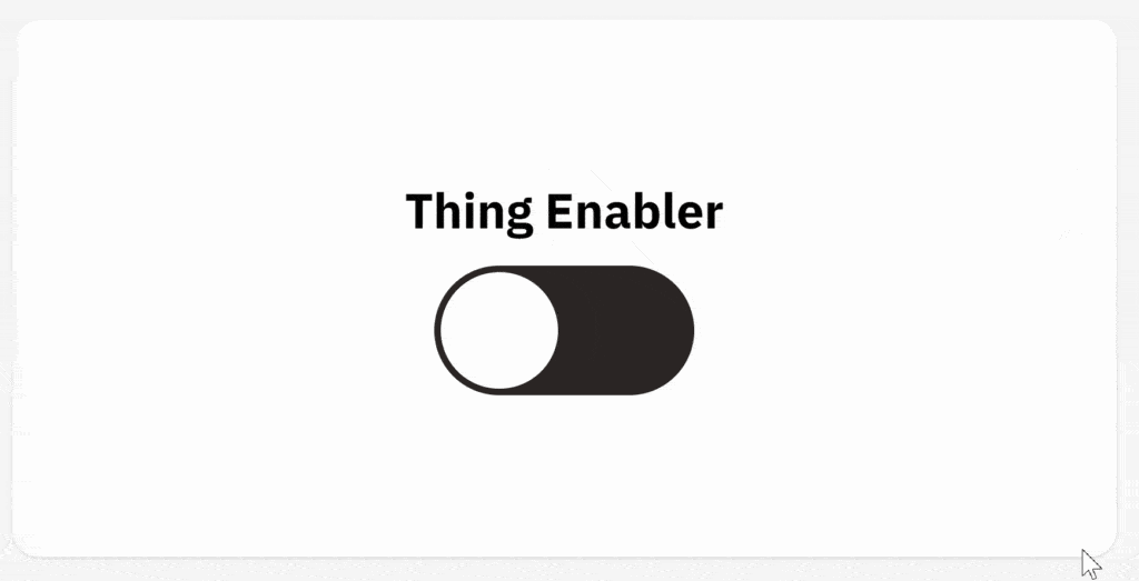
We can use Framer Motion’s layout management to create a very clean and short toggle switch component.

Here’s the code for our switch:
function Toggle() {
    const [enabled, setEnabled] = useState(false);
    useEffect(() => {
        setEnabled(Math.random() > 0.5);
    }, []);
    const toggle = () => setEnabled((old) => !old);

    return (
        <div
            onClick={toggle}
            className={clsx(
                'flex aspect-[2/1] w-1/4 rounded-full bg-stone-800 p-1',
                enabled ? 'justify-end' : 'justify-start'
            )}>
            <motion.div
                className="flex aspect-square h-full flex-row items-center justify-center overflow-clip rounded-full bg-white p-1 text-stone-800"
                layout
            />
        </div>
    );
}
We’re storing the state of our switch in a usestate hook. Whenever we click the component, this gets toggled.
Then I’m using that value with Tailwind to change whether the circle is at the start or the end of our switch.
Our switch works up to this point, it would just snap between the two positions. Framer motion lets us animate between these two with one word, just adding in the layout prop. Similarly to before, this tells the library to animate between layout changes, in this case, a change in the positioning of our component.
Progress Bar
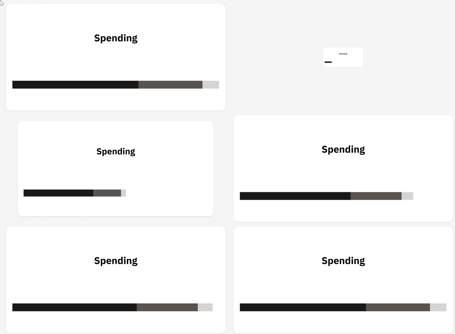
Next up we have a progress bar. I’m using Framer Motion here to add in a slick animation, where the bar fills up when the page loads.

Here’s the code for our progress bar:
export function ProgressBar() {
    return (
        <motion.div
            className="my-12 flex h-6 w-full flex-row"
            initial="hide"
            animate="show"
            transition={{ staggerChildren: 0.2 }}>
            <InnerProgressBar className="bg-stone-900" value={0.61} />
            <InnerProgressBar className="bg-stone-600" value={0.31} />
            <InnerProgressBar
                className="bg-stone-300"
                value={1 - 0.61 - 0.31}
            />
        </motion.div>
    );
}
Like before, Framer Motion will animate from whatever animation we set as the “initial”, to “animate”, when our component is rendered. There are no actual animations for the whole progress bar, but the important thing is that when the variant of our parent changes, this gets passed on to its children. It also lets us stagger and delay the animations for its children.
In the InnerProgressBar:
const InnerProgressBarVariants: Variants = {
    hide: { width: 0 },
    show: (w) => ({ width: w, transition: { duration: 2, ease: 'easeOut' } }),
};
One of the things Framer Motion lets us do is define animations as a function, and you can pass parameters to that function in the component. I’m using this so the inner progress bar animates to its width.
Then the inner progress bar is a really simple component:
function InnerProgressBar({
    className,
    value,
}: {
    className: string;
    value: number;
}) {
    return (
        <motion.div
            className={className}
            variants={InnerProgressBarVariants}
            custom={`${value * 100}%`}
        />
    );
}
Just a solid div, but the important part is that it passes on its custom value to our variant.
Conclusion
That’s all! Hopefully, by talking you through this project, I’ve given you a nice tour of all the features Framer Motion offers. It’s a very versatile library that offers a lot of functionality for animating your web apps. You can check out the full code for this project here. If you liked this article, or if you’re having any issues, feel free to leave a comment!
💬 Leave a comment