
In this tutorial I will walk you through setting up Tailwind in your React Application. Afterwards, we will build a simple app that showcases Tailwind’s powerful features! This tutorial requires a basic level of understanding of both React and CSS.
Table of Contents
What is Tailwind? Why would I use it?
Tailwind is a utility library for CSS. It contains pre-built classes for spacing, display, color, and pretty much anything else you could come up with. Tailwind’s goal is to make styling your web-app simpler, faster and more consistent. This might sound superfluous or clunky at first, but wait till you give it a try. I promise it is more intuitive than it sounds!
Setup
I’m going to be creating a new React App using create-react-app. Then I’ll follow the instructions from the Tailwind docs to install and configure the necessary files. If you want to skip this process, you can always fork the completed demo and work from there!
First, create your React App
npx create-react-app my-project
cd my-project
Once you’re in your project repository, install the latest version of Tailwind, along with a few other packages that
npm install -D tailwindcss@npm:@tailwindcss/postcss7-compat postcss@^7 autoprefixer@^9Then, install CRACO. CRACO is a package that overrides some default CSS settings and lets us properly configure Tailwind
npm install @craco/cracoOnce that’s installed, update the scripts section of your package.json to use CRACO instead of react-scripts
  {
    // ...
    "scripts": {
     "start": "craco start",
     "build": "craco build",
     "test": "craco test",
     "eject": "react-scripts eject"
    },
  }
Next, create a craco.config.js at the root of your project and paste this code in the file:
// craco.config.js
module.exports = {
  style: {
    postcss: {
      plugins: [
        require('tailwindcss'),
        require('autoprefixer'),
      ],
    },
  },
}
Next, you’ll have to generate a tailwind.config.js file. This will let you configure your Tailwind options exactly how you like it. It will come in handy later! Generate the file by typing npx tailwindcss-cli@latest init in your console.
Finally, we’re going to overwrite our index.css file to include Tailwind in the project. Delete everything you have in there and add these import statements:
@tailwind base;
@tailwind components;
@tailwind utilities;
The last step is optional, but I 100% recommend it. VSCode has an extension called Tailwind CSS IntelliSense that adds class name suggestions and shows the actual CSS behind every Tailwind class in a popup. If you’re using VSCode, I highly recommend installing the extension for a much smoother Tailwind experience.
And we’re done! We’re ready to start writing some code and styling it with Tailwind. I know that was a lot, but you’ll see the benefit shortly.
Creating Our App
I’m going to put Tailwind to the test by using it to recreate part of Discord’s UI.
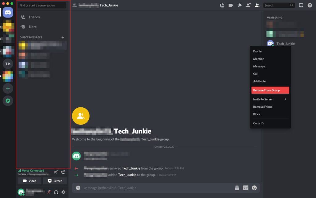
I really like the clean look of that sidebar, so I’m going to recreate it in Tailwind
The first thing I’m going to do is add some custom colors to Tailwind. Tailwind comes with a bunch of preset colors that are super easy to use, but in this case I want to get the exact colors discord uses. To do that, I’m going to edit my tailwind.config.js file:
module.exports = {
  purge: ['./src/**/*.{js,jsx,ts,tsx}', './public/index.html'],
  darkMode: false, // or 'media' or 'class'
  theme: {
    extend: {
      colors: {
        lightGray: '#99AAB5',
        slateLight: '#2C2F33',
        slateDark: '#23272A',
      },
    },
  },
  variants: {
    extend: {},
  },
  plugins: [],
};
Now that I’ve added those colors, Tailwind will automatically generate utility classes that let me apply them easily
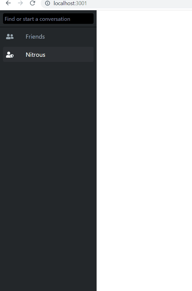
The next step is to start writing our markdown. I’ll create a <div> with these classes:
<div className="fixed left-0 bg-slateDark h-screen flex flex-col w-64">
All the Tailwind class names are super intuitive, and the best way to learn them is honestly just to start typing out the CSS rule you need; Tailwind’s intellisense will do the rest. In the above example, I created a <div> fixed to the left side, with a background color. As you can see, I was able to use my custom color “slateDark” as part of the classes Tailwind provides. If I hadn’t done that, I would still have access to tons of default classes like “bg-grey-800” for a similar look. Next, lets add some inputs, buttons and profiles to finish up our UI
Tailwind + Components
One of the most compelling reasons to use Tailwind with React is how well it integrates with React’s component structure. You can write your CSS one time in the component definition, and reap the benefits every time you reuse that element. For this app, I’ll be creating a component for the top two buttons “Friends” and “Nitro” on the sidebar. Here’s what my code looked like:
function TopButton({ title, icon }) {
  return (
    <div className="m-2 my-1 rounded p-2  text-lightGray cursor-pointer hover:bg-slateLight hover:text-white">
      <FontAwesomeIcon icon={icon} className="mr-8" />
      {title}
    </div>
  );
}
Here’s what that looked like:
Something that I really enjoy about Tailwind is how easy they make it to use CSS Pseudo-classes. In this case, I am simply appending the “hover” selector in front of the classes I want to apply. Now I have a nice effect where my background color and text color change when I mouse over these buttons.
Refactor with @apply
The next thing I want to do is create a reusable Friend.js component for my friends, which will be the final element in our UI. As I was creating that element, I realized I wanted it to behave very similarly to the two buttons I had above, just with a profile image instead of an icon. I wanted the border-radius, hover effects and text color to all be the same. So, I decided to use Tailwind’s @apply feature to create a reusable CSS class.
The first thing I did was copy all the CSS I had in my TopButton component
<div className="m-2 my-1 rounded p-2 text-lightGray cursor-pointer hover:bg-slateLight hover:text-white">Then, in my index.css file, I used @apply to create a custom class using all those Tailwind classes
.sidebar-item {
  @apply hover:bg-slateLight m-2 my-1 rounded p-2 hover:text-white text-lightGray cursor-pointer;
}
Finally, in both my Friend.js and TopButton.js files, I replaced that string of classes with the sidebar-item class. Now my code is a lot more concise, and I can reuse that class if I ever want to create something with the same effects.
function Friend({ image, name }) {
return (
<div className="sidebar-item">
<FontAwesomeIcon icon={image} className="mr-4" size="lg" />
{name}
</div>
);
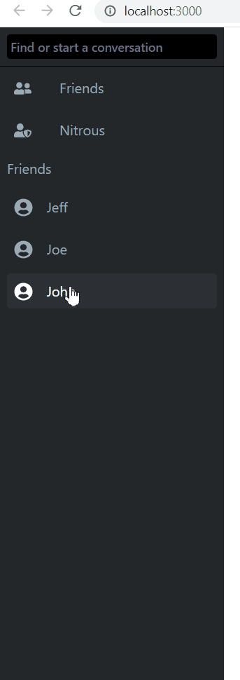
}My final product looked like this, a pretty spot on replication of the Discord UI element:
Summary
With that, we’ve completed our Tailwind project and learned a few tips for streamlining our workflow. I would encourage you to play around with the library, and just explore the tools at your disposal. That is truly the best way to learn Tailwind. There are so many more things you can do with this library, so don’t stop learning here!
💬 Leave a comment