You’ve started learning React and heard of something called React component. So what’s a React component?
React is a library that lets us split our UI into re-usable parts; these parts are called React components. The key to understanding React is to understand how we can use the components in multiple places in our code.
Think of a React component as a function; it gets some parameters and outputs a UI according to that parameters. These parameters are called props. For example, we can give colour, size, text data as our props.
So let’s jump right into an example.
First, create a react app by passing the following code into the terminal:
npx create-react-app learn-react
And now we have a React app called learn-react.
In learn-react folder, create a .js file under the src directory, like this:
src/MyComponent.js
import React from 'react';

const MyComponent = () => {
  return (
    <div>MyComponent</div>
  )
}

export default MyComponent;
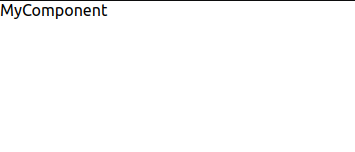
The above code is an example of the most basic React component. It’s a functional component, doesn’t get any props yet, and returns a div.
To see it working, jump into the App.js file under src and replace the App.js with the following code:
src/App.js
import React from 'react';
import MyComponent from './MyComponent';

const App = () => {
  return (
    <MyComponent />
  )
}

export default App;
App is also a functional component; it returns the MyComponent component as its child. So, a component can return other components inside itself.
The rendered output will look like this:
We’ve talked about re-using components and customising them using props. So let’s learn how to use a component with props.
Go back to MyComponent.js and update it like this:
src/MyComopnent.js
import React from 'react';

const MyComponent = ({ backgroundColor, text }) => {
    return (
        <div style={{ backgroundColor: backgroundColor }}>
            {text}
        </div>
    )
}

export default MyComponent;
Now MyComponent takes two props, one is backgroundColor, and the other is text. Let’s see them in action. Jump into App.js and update the code like this:
import React from 'react';
import MyComponent from './MyComponent';

const App = () => {
  return (
    <div>
      <MyComponent backgroundColor="red" text="hello" />
      <MyComponent backgroundColor="yellow" text="dog" />
    </div>
  )
}

export default App;
You can see that we’ve passed props into our components and wrapped them into a single div.
The output looks like this:
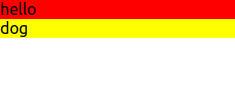
So instead of creating two components for hello and dog divs, we made one single component and customised the component using props. This is very useful when we’re building user-friendly websites.
So, for example, let’s try to build a bit more advanced popup component:
Create a Popup.js file under src folder and put the below code:
src/Popup.js
import React from 'react';

const Popup = ({
    backgroundColor,
    titleColor,
    text,
    title,
    width,
    height
}) => {
    return (
        <div
            style={{
                backgroundColor: backgroundColor,
                width: width,
                height: height,
                borderRadius: "0.5rem",
                padding: "1rem",
                margin: "1rem"
            }}
        >
            <div
                style={{
                    color: titleColor,
                    fontSize: "1.5rem"
                }}
            >
                {title}
            </div>
            {text}
        </div>
    )
}

export default Popup
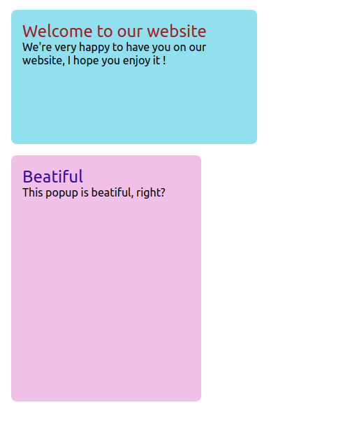
So we’ve successfully built the Popup component; let’s try it. Jump into App.js and update it like this:
src/App.js
import React from 'react';
import Popup from './Popup';

const App = () => {
  return (
    <div>
      <Popup
        backgroundColor="#90e0ef"
        titleColor="#9b2226"
        text="We're very happy to have you on our website, I hope you enjoy it !"
        title="Welcome to our website"
        width="20rem"
        height="10rem"
      />
      <Popup
        backgroundColor="#f1c0e8"
        titleColor="#3a0ca3"
        text="This popup is beatiful, right?"
        title="Beatiful"
        width="15rem"
        height="20rem"
      />
    </div >
  )
}

export default App;
And the output will look like this:
To learn more about components, states, hooks, you can check this nice article:
And this is it for this article, I hope you enjoyed and learned a lot.
💬 Leave a comment