You probably have heard about Bootstrap before, especially in the context of using it with React applications. Bootstrap is a component library that allows you to import ready to use components.
Installation
Installing Bootstrap is a quite straightforward process. All you have to do is to run the
$ npm install react-bootstrap bootstrap@5.1.3
from the root directory of your application.
Assuming that the package was installed successfully, now you can start using it.
Stylesheets
By default Bootstrap doesn’t ship any CSS, you will need to import it yourself to the application.
If you’re using classic CSS, include the below import statement in the entry point of your application. In my case, that’s the index.js file located in the src directory.
import 'bootstrap/dist/css/bootstrap.min.css';However, if you’re using SASS then it’s just slightly more complicated. You need to add the below import to the App.scss file
@import "~bootstrap/scss/bootstrap";and then import it in your index.js file, which again should be located in the src directory.
import './App.scss';Now you should be able to use the Bootstrap components. Let’s take a look at how it’s done!
How to use Bootstrap
To view the list of available components please refer to the official documentation. We’re going to take a look at a few most commonly used ones.
To use the Bootstrap components in your React application you need to first import the specific components. Make sure that you import the individual components as opposed to the whole package. It’s better for the performance of your application.
Let’s take a look at the Badge component. It’s commonly used to draw the attention of users to some interesting page elements.
import 'bootstrap/dist/css/bootstrap.min.css';
import Badge from 'react-bootstrap/Badge';

function App() {
  return (
    <div style={{ margin: '50px' }}>
      <h1>Example badge <Badge>New</Badge></h1>
      <h1>Example badge <Badge bg="secondary">New</Badge></h1>
      <h1>Example badge <Badge bg="success" text="dark">New</Badge></h1>
      <h1>Example badge <Badge bg="warning">New</Badge></h1>
      <h1>Example badge <Badge bg="warning" text="dark">New</Badge></h1>
    </div>
  );
}

export default App;
At the top of the file, we imported the Badge components from the react-bootstrap package. We then are using it in four different variations. Bootstrap components are customizable so you can provide certain props to easily modify the way they look to be a better fit for your page. For a full list of options, you should always consult the official documentation.
Let’s take a look at the output of the above code snippet.
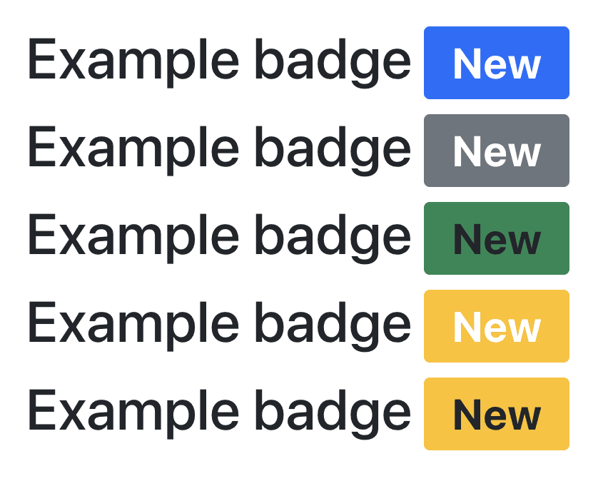
Now go back to the code and see how our parameters influenced the way these badges look.
We can also take a look at how to use Button.
import 'bootstrap/dist/css/bootstrap.min.css';
import Button from 'react-bootstrap/Button';

function App() {
  return (
    <div style={{ margin: '50px' }}>
      <Button>Hello world!</Button>
      <Button variant="secondary">Hello world!</Button>
      <Button variant="success" size="sm">Hello world!</Button>
      <Button variant="outline-danger" size="lg">Hello world!</Button>
      <Button disabled>Hello world!</Button>
    </div>
  );
}

export default App;
Which should then render.

Overall I think that Bootstrap is a great framework to develop React applications with. It lets you start building good looking interfaces relatively fast. It also allows for customisation in case what you’re looking for is not exactly there.
💬 Leave a comment