When we want to share logic between two Javascript functions, we extract it to a third function. Both components and Hooks are functions, so this works for them too.
A custom Hook is a JavaScript function whose name starts with “use” and that may call other Hooks.
Why do we need a custom responsivity hook?
In today’s world, every website design should be mobile-first. A custom hook for responsivity can help us to solve many styling problems. For example, we can render something differently on mobile screens, etc.
Let’s jump right into coding and learn by doing. First, create a react app. Then, create a useResponsivity.js file, you can put this file anywhere under the src folder.
src/hooks/useResponsivity.js
import { useState, useEffect } from 'react';
const useResponsivity = () => {
    const [isOnMobile, setIsOnMobile] = useState(true);
    useEffect(() => {
        /*Check the screen size on every render, prevent possible bugs by
        checking the screen size and setting the isOnMobile when necessary.
        */
        function handleResize() {
            if (window.innerWidth >= 800) {
                setIsOnMobile(false);
            }
            else { setIsOnMobile(true) }
        }
        handleResize();
        window.addEventListener("resize", handleResize);

        //Cleanup the useEffect when the component unmounts
        return () => window.removeEventListener("resize", handleResize);
    }, []);
    return isOnMobile;
}
export default useResponsivity;
In the above code, the window object is a global object of DOM. As we said, custom hooks are functions that use other hooks. So in our custom hook, we use useState and useEffect.
We store isOnMobile in useState, constantly check whether isOnMobile , inside useEffect, and at the end, we return isOnMobile .
Use a custom hook in a component
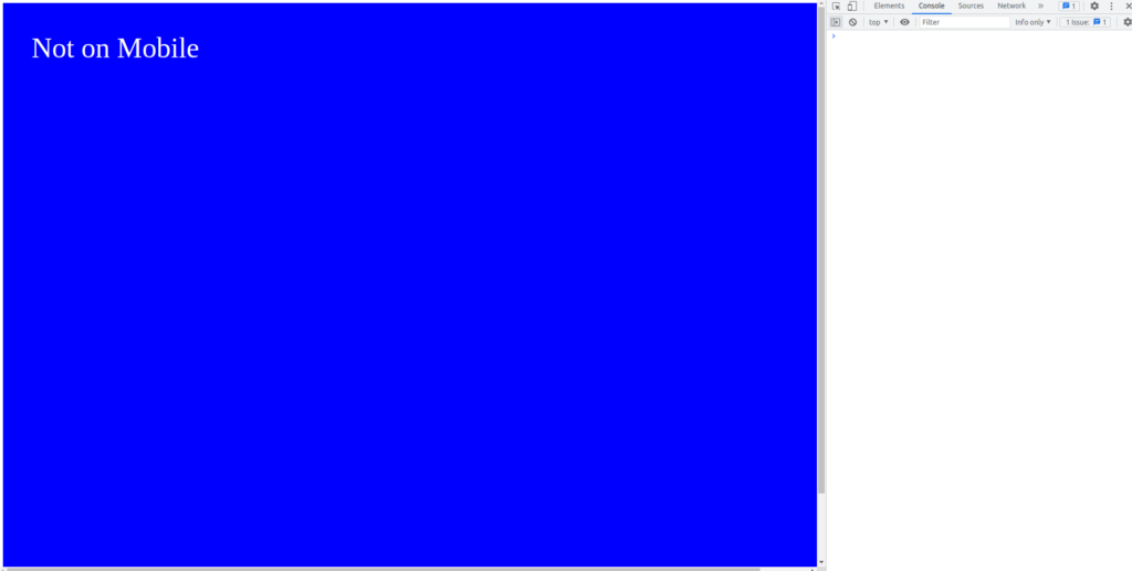
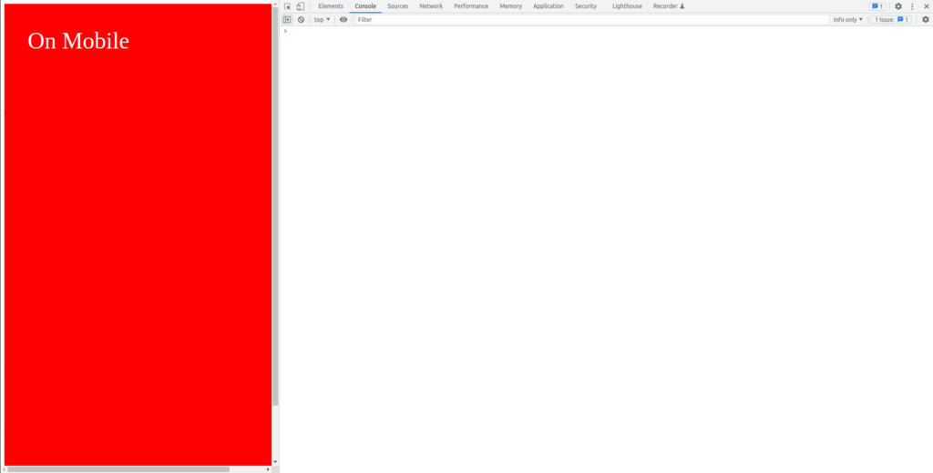
We can get up-to-date isOnMobile information with the useResponsivity hook. It returns whether the window’s size is a mobile size or not. In the below example, the background-color of the StyledApp component changes by the isOnMobile value.
Note: To learn more about styled-components, checkout this :
https://upmostly.com/tutorials/how-to-use-styled-components-in-react
import styled, { css } from 'styled-components';
import useResponsivity from './hooks/useResponsivity';

const App = () => {
  const isOnMobile = useResponsivity();
  return (
    <StyledApp isOnMobile={isOnMobile}>
      {isOnMobile ? "On Mobile" : "Not on Mobile"}
    </StyledApp>
  )
};

const StyledApp = styled.div`
width:100%;
height:100vh;
background-color:blue;
color:white;
padding:3rem;
font-size:3rem;

${({ isOnMobile }) =>
    isOnMobile && css`
background-color:red;
`}
`
Output:
That’s is for this article, I hope you enjoyed and learned a lot.
💬 Leave a comment