Material UI is an extremely useful library of React components that are ready to be used in your application. You can use those like Lego pieces to build beautiful interfaces. The components are ready to go and require minimal amounts of customisation. It saves a lot of development time and lets you hit the ground running.
Installation
Let’s take a look at how to install it in your application. In the root directory of your application run the following command.
$ npm install @mui/material @emotion/react @emotion/styled
Roboto font
Another step is to install the Roboto font. MUI components were designed with Roboto in mind, hence it makes for a better experience to use this font. I suggest you do this via npm as well. Go ahead and execute the below command.
$ npm install @fontsource/roboto
Now that you have the new font installed make sure that you import it at the very source of your React application. If you used create-react-app to set up your project then that should be src/idnex.js.
import '@fontsource/roboto/300.css';
import '@fontsource/roboto/400.css';
import '@fontsource/roboto/500.css';
import '@fontsource/roboto/700.css';
Font Icons / SVGs
The next step is to install the MUI icons package, again we can use the npm to do that
$ npm install @mui/icons-material
And voila! You have just installed Material UI in your application. Let’s use it, shall we?
How to use Material UI
How about we play a bit with buttons and take a look at different button variants that Material UI has to offer. When we’re done remember to check out the official documentation yourself.
import Button from "@mui/material/Button";
const App = () => {
return (
<div>
<Button variant="text" sx={{m: 2}}>
Hello World
</Button>
<Button variant="contained" sx={{m: 2}}>
Hello World
</Button>
<Button variant="outlined" sx={{m: 2}}>
Hello World
</Button>
</div>
);
};
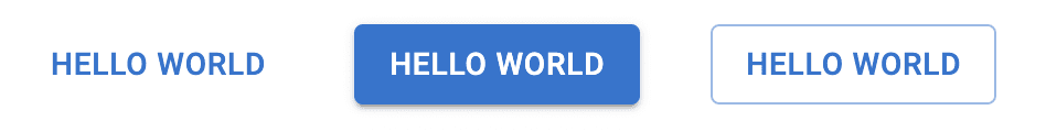
export default App;In the above code snippet, we’re starting by importing the Button element from the MUI package that we had just installed. We’re then rendering 3 different ‘Hello Worlds’ buttons in our app.
We’re using the variant property to check out the variety of available buttons and we’re adding some margin around them by utilising the sx prop, which allows us to inject some custom styling.
Our app should now render the following.
Let’s expand on the above example and add some more buttons. How about we combine buttons with the SVG icons that we had just installed? We can do that by passing the relevant icons into the startIcon or endIcon properties.
import Button from "@mui/material/Button";
import DeleteIcon from "@mui/icons-material/Delete";
import SendIcon from "@mui/icons-material/Send";

const App = () => {
  return (
    <>
      <div>
        <Button sx={{ m: 2 }} variant="text">
          Hello World
        </Button>
        <Button sx={{ m: 2 }} variant="contained">
          Hello World
        </Button>
        <Button sx={{ m: 2 }} variant="outlined">
          Hello World
        </Button>
      </div>
      <div>
        <Button sx={{ m: 2 }} disabled>
          Hello World
        </Button>
        <Button
          sx={{ m: 2 }}
          variant="outlined"
          startIcon={<DeleteIcon />}
        >
          Delete
        </Button>
        <Button
          sx={{ m: 2 }}
          variant="contained"
          endIcon={<SendIcon />}
        >
          Send
        </Button>
      </div>
    </>
  );
};

export default App;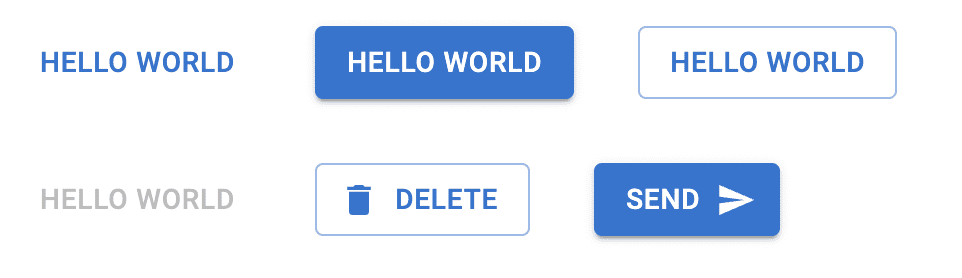
I hope this article helped you to get a little bit more familiar with MUI.
💬 Leave a comment