When it comes to styling out components in React we do have plenty of choices ranging from vanilla CSS, to CSS/SCSS Modules, to even using a UI library/framework such as Bootstrap or Material UI.
However, when it comes to integrating them with our React applications, something doesn’t feel right, especially when trying to conditionally style certain aspects of our components depending on either state or props.
That’s exactly when Styled Components come to the rescue!
What exactly are Styled Components in React?
They are pretty much what they sound like; components imbued with stylings that gracefully merge stylesheets with the JavaScript flavor of React.
They are more or less to CSS what JSX is to JavaScript.
As the headline on the official styled-components website says, it lets you “use the best bits of ES6 and CSS to style your apps without stress 💅🏾”.
Why would you need them in your application?
Well, that’s a good question.
A beneficial scenario for styled-components is when you need to develop props-driven UI components which need to be versatile and highly customizable, be it a button, a trigonometric shape, or any other UI element.
Apart from that, styled-components come with a handful of benefits, such as:
- Less clutter in your components
- Less bulky components
- Full theming support
- Ease of testing (Support provided by
jest-styled-componentslibrary)
These are especially relevant if you are looking to refactor an existing codebase or create a lightweight library of components that are bound to a theming convention and are easy to test as well.
It might also help to have a look at the portfolio of websites and companies that are using styled-components in their tech repertoire for some inspiration here.
Code Showcase
Nothing does the job of presenting a library or concept in programming better than some code samples. As such, we’ll look at how we would create a generic button component using the styled-components library.
In order to bring that into your project, all that needs to be done is to install it using the package manager of choice:
- npm:
npm install --save styled-components - yarn:
yarn add styled-components
And then import it into the project like this:
import styled from 'styled-components';Pretty standard stuff. Let’s now create our styled Button component in a new index.jsx file under the src/components/Button directory:
import styled, { css } from 'styled-components'

const Button = styled.button`
  background: transparent;
  border-radius: 3px;
  border: 2px solid palevioletred;
  color: palevioletred;
  margin: 0 1em;
  padding: 0.25em 1em;
  font-size: 1.25rem;

  ${props =>
    props.primary &&
    css`
      background: palevioletred;
      color: white;
    `};
`;

export default Button;
You can see that the syntax might be a bit weird, but once you get used to the backticks (“`) it gets pretty intuitive.
Apart from the stringified CSS code, you might notice that we’re also using props to apply different styling to our button. You don’t have to use the css import, as you can also return a plain string as well as styles and it should be working just fine.
We can now use our new Button component inside the App component:
import './App.css';
import Button from './components/Button';
import styled from 'styled-components'

const Container = styled.div`
  text-align: center;
  margin-top: 2.5rem;
`

function App() {
  return (
    <div className="App">
      <Container>
        <Button>Normal Button</Button>
        <Button primary>Primary Button</Button>
      </Container>
    </div>
  );
}

export default App;
Here you can notice that we’ve also created a new Container element for the sake of positioning our default and primary buttons, which would look something like this:

styled-componentsComponent Overriding
There are some scenarios where we want to override the stylings of a particular component, and that’s a feature that the styled-components library has as well.
Let’s say that we wish to add a new component called HoverableButton that extends the base Button component with some visual effects when hovered over.
We’ll create that under src/components/HoverableButton/index.jsx and it will look something like this:
import styled from "styled-components";
import Button from "../Button";

const HoverableButton = styled(Button)`
  &:hover {
    opacity: 0.75;
  }
`;

export default HoverableButton;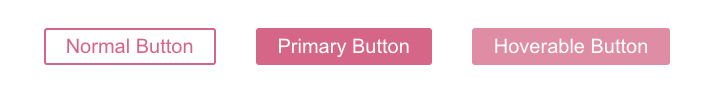
Theming Support
As mentioned in the first part of the article, styled-components provide theming support through a ThemeProvider context that can be imported from the library.
It takes a theme prop that shall be an object containing properties that help us define our components theme.
Let’s try it right now by making our buttons contour color mediumseagreen; we have to first import the ThemeProvider context and pass it to the theme configuration object and wrap our components within it:
import './App.css';
import Button from './components/Button';
import styled, { ThemeProvider } from 'styled-components'
import HoverableButton from './components/HoverableButton';

const Container = styled.div`
  text-align: center;
  margin-top: 2.5rem;
`

function App() {
  const theme = {
    color: 'mediumseagreen',
  };

  return (
    <div className="App">
      <Container>
        <ThemeProvider theme={theme}>
          <Button>Normal Button</Button>
          <Button primary>Primary Button</Button>
          <HoverableButton primary>Hoverable Button</HoverableButton>
        </ThemeProvider>
      </Container>
    </div>
  );
}

export default App;
And then we shall update our components to use the theme values rather than what we have previously defined them to use:
import styled, { css } from 'styled-components'

const Button = styled.button`
  background: transparent;
  border-radius: 3px;
  border: 2px solid ${(props) => props.theme.color};
  color: ${(props) => props.theme.color};
  margin: 0 1em;
  padding: 0.25em 1em;
  font-size: 1.25rem;

  ${props =>
    props.primary &&
    css`
      background: ${(props) => props.theme.color};
      color: white;
    `};
`;

export default Button;
We only to update our base Button component, as the derived HoverableButton will extend this configuration as well.

Summary
So, that’s pretty much it for today’s article. We’ve been able to iterate over some of the main benefits of using styled-components, the main scenario, apart from the benefits, where the approach is best-suited, some code samples, and we’ve been also able to document our code examples in order to get a better understanding of what’s happening.
I really hope you’ve enjoyed reading this article and got a better or a clearer understanding of what Styled Components are, and when/how/why you should use them in your current or next React applications.
If you want to learn more about the alternatives to styled-components, be sure to check out this other article.
If you feel like I’ve missed anything, or would to start up a constructive discussion in regards to anything I’ve mentioned in this article, feel free to leave a comment below and we’ll pick that up. 😉
See you at the next one. Cheers!
💬 Leave a comment