In this tutorial, we’ll learn how to use React Dropzone to create an awesome file uploader. Keep reading to learn more about react-dropzone.
Read part two in the React file upload series: Upload a File from a React Component
To begin, open up an existing React project. If you don’t have an existing React project that uses the react-dropzone library, generate a new one using Create React App. I’ll show you how to do this below.
Call the new project file-upload.
I’m also showing you the option to install Bootstrap, which I’ll be using in the examples throughout this tutorial.
npx create-react-app file-upload
cd file-upload
npm install --save react-dropzone

// Optional
npm install --save bootstrap
A Basic React Dropzone File Picker
We’re going to start by building a very simple file picker using React Dropzone.
As an extra challenge, try to follow this tutorial using React Hooks. If you’re new to Hooks, I’ve written a simple introduction to React Hooks.
Jump into App.js and start by removing the boilerplate code in the render function. After you’ve stripped out this unwanted code, import the React Dropzone library at the top of the file, below all of the other imports.
Finally, add the React Dropzone component to the return of the render method, as well as an onDrop method above it.
Your App.js should look like this:
import React, { Component } from 'react';
import Dropzone from 'react-dropzone'

class App extends Component {

  onDrop = (acceptedFiles) => {
    console.log(acceptedFiles);
  }

  render() {
    return (
      <div className="text-center mt-5">
        <Dropzone onDrop={this.onDrop}>
          {({getRootProps, getInputProps}) => (
            <div {...getRootProps()}>
              <input {...getInputProps()} />
              Click me to upload a file!
            </div>
          )}
        </Dropzone>
      </div>
    );
  }
}

export default App;
React Dropzone only needs one method passed into the onDrop prop to handle files when they’re selected.
To keep things simple, we’ll name the method the same as the prop: onDrop.
Our onDrop method has a single parameter, acceptedFiles, which for the time-being we log out to the console. This is only for testing purposes.
Save the component, open your browser and go to your running React app. Click the text label and a file picker window will open up! Great! We’ve got a basic file picker working.
Clicking a file to upload won’t do anything just yet. For that to work, we have to send the file to a server, which we’ll cover at a later date.
Let’s continue to explore what else React Dropzone can do!
Render Props
Dropzone may look different to other React components you’ve seen. This is because it uses the Render Props technique.
The Render Prop Function is used to change the HTML inside of the Dropzone component, based on the current state of Dropzone.
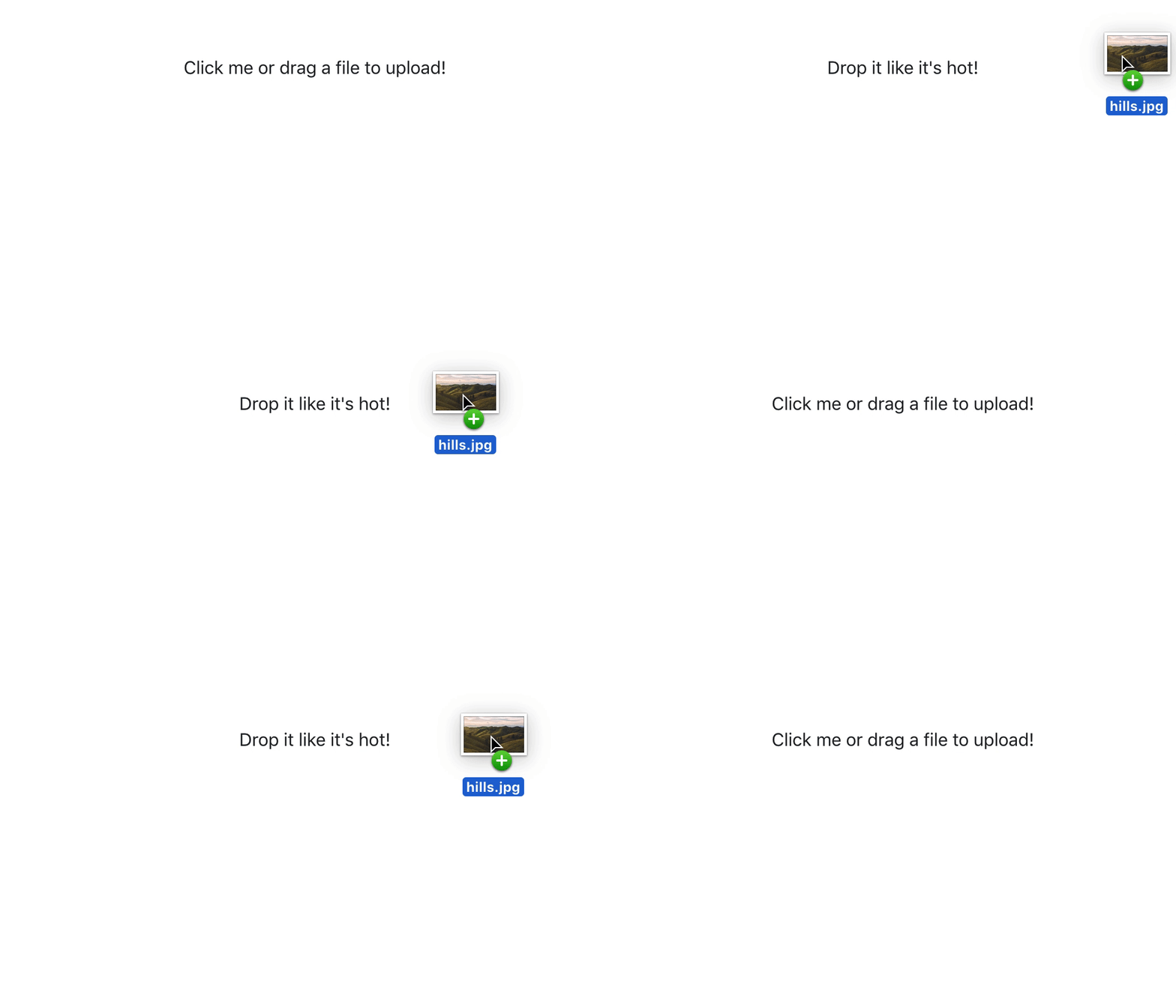
To demonstrate, let’s add a variable to the Render Prop function called isDragActive. This gives us access to Dropzone’s current drag state.
Now that we have access to the isDragActive state, we can change the text value of the label to show something different when a file is dragged over the component.
<Dropzone onDrop={this.onDrop}>
  {({getRootProps, getInputProps, isDragActive}) => (
    <div {...getRootProps()}>
      <input {...getInputProps()} />
      {isDragActive ? "Drop it like it's hot!" : 'Click me or drag a file to upload!'}
    </div>
  )}
</Dropzone>
In the code above, we’re writing an inline conditional that checks if isDragActive is true. If it is, write “Drop it like it’s hot”, else write, “Click me or drag a file to upload!”.
Let’s jump back to the browser and see it in action.

Allowing Specific Types of File
Currently, our file picker allows us to pick any type of file to upload.
Depending on what you’re using a file picker for, you may want to allow specific types of files, such as only .JPG files, or only .XLS and .DOCX files.
To do this, we’ll use the accept prop.
Let’s add the accept prop after onDrop within the Dropzone component declaration, like so:
<Dropzone
  onDrop={this.onDrop}
  accept="image/png, image/gif"
>
...
</Dropzone>
File types are written as MIME types, with multiple values separated by a comma. Mozilla has a great resource that gives a full list of MIME types.
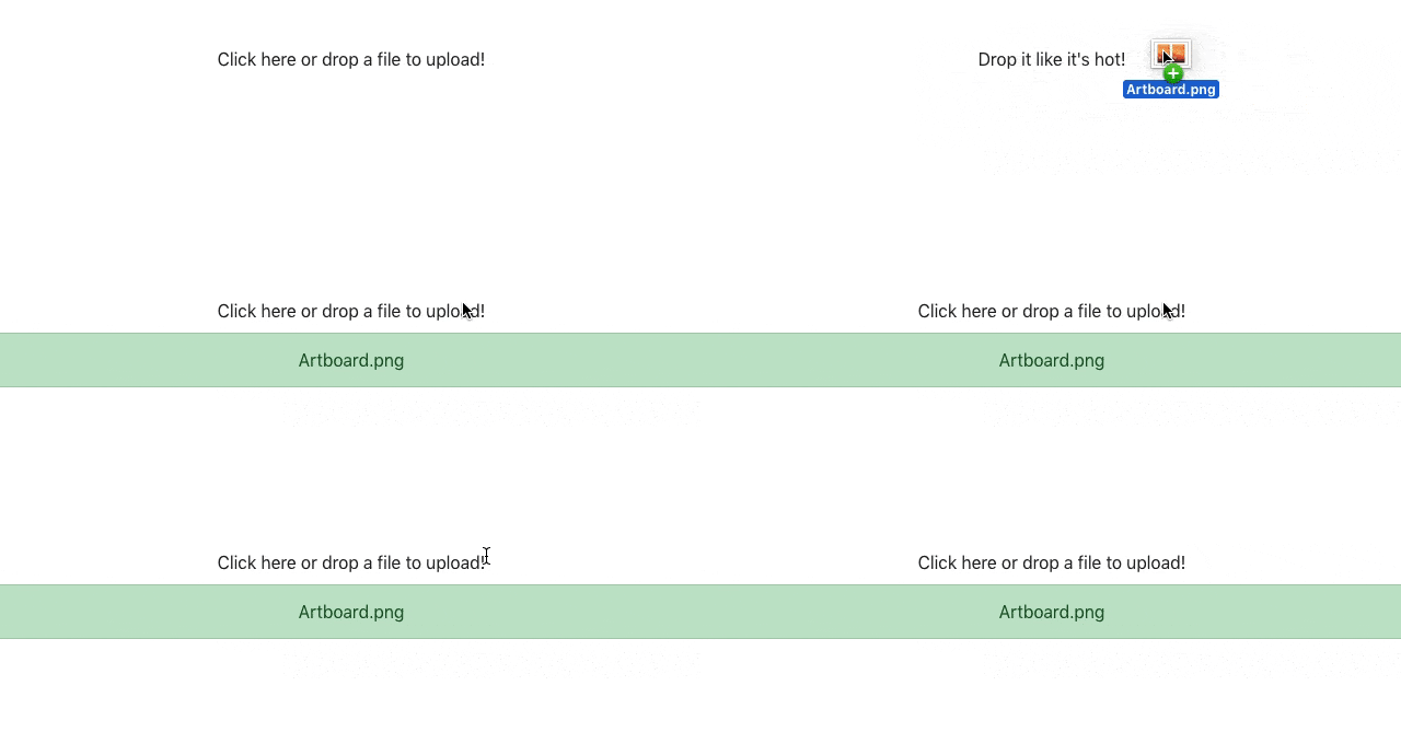
Let’s improve our file picker user experience by showing a message if the user tries to upload a file type that’s not accepted.
To do that, we’ll add another render prop called isDragRejected. We’ll move around the inline conditional logic somewhat to account for this new render prop.
<Dropzone
  onDrop={this.onDrop}
  accept="image/png"
>
  {({getRootProps, getInputProps, isDragActive, isDragReject}) => (
    <div {...getRootProps()}>
      <input {...getInputProps()} />
      {!isDragActive && 'Click here or drop a file to upload!'}
      {isDragActive && !isDragReject && "Drop it like it's hot!"}
      {isDragReject && "File type not accepted, sorry!"}
    </div>
  )}
</Dropzone>
Save the file, hop on back to your browser and try to drag a .JPG file onto the file picker.

A message appears letting the user know that our file picker doesn’t accept that type of file. Perfect!
Minimum and Maximum File Size
Specifying the minimum and maximum file size is very important. In a real world file uploader, you wouldn’t want one of your users dragging in a 1GB file to upload, and crippling your server.
Luckily we can limit the size of the file that’s being uploaded in React Dropzone through two props, minSize and maxSize. Both of these props take a number value specified in bytes.
For your reference, 1 Megabyte = 1048576 Bytes.
Jump back into your code, and add the two minSize and maxSize props to the Dropzone component, right underneath the accept prop.
<Dropzone
  onDrop={this.onDrop}
  accept="image/png"
  minSize={0}
  maxSize={5242880}
>
  ...
</Dropzone>
We’re accepting a file with a maximum size of 5MB and under in the example above.
Let’s add some more code to our file input component that checks the maximum file size and displays an error message if the file being uploaded is larger.
render() {
  const maxSize = 1048576;
  return (
    <div className="text-center mt-5">
      <Dropzone
        onDrop={this.onDrop}
        accept="image/png"
        minSize={0}
        maxSize={maxSize}
      >
        {({getRootProps, getInputProps, isDragActive, isDragReject, rejectedFiles}) => {
          const isFileTooLarge = rejectedFiles.length > 0 && rejectedFiles[0].size > maxSize;
          return (
            <div {...getRootProps()}>
              <input {...getInputProps()} />
              {!isDragActive && 'Click here or drop a file to upload!'}
              {isDragActive && !isDragReject && "Drop it like it's hot!"}
              {isDragReject && "File type not accepted, sorry!"}
              {isFileTooLarge && (
                <div className="text-danger mt-2">
                  File is too large.
                </div>
              )}
            </div>
          )}
        }
      </Dropzone>
    </div>
  );
}
It might look like we’ve added a lot, but actually it’s less than 10 lines.
- At the top of the render method, we declare a new const called maxSize and set it to 1MB.
- Reference this new maxSize variable in the maxSize prop within Dropzone.
- We add another render prop to Dropzone called rejectedFiles
- Directly underneath the render prop function within Dropzone, we declare another const called isFileTooLarge, which gets the first file from the rejectedFiles array prop, and checks to see if the size is greater than our maxSize variable.
- Finally, we’re writing an inline conditional that checks if isFileTooLarge is true, and renders ‘File is too large.’ in red.
Let’s see it in action!

Multiple Files
The last feature of React Dropzone that we’ll cover is the ability to upload multiple files.
This one is fairly simple, as we’re not adding any code inside the render prop function.
Just add the multiple prop to the React Dropzone component declaration, like so:
<Dropzone
  onDrop={this.onDrop}
  accept="image/png"
  minSize={0}
  maxSize={maxSize}
  multiple
>
  ...
</Dropzone>
React Dropzone using Hooks
Since writing this tutorial React Hooks have been officially released, and the react-dropzone library has been updated to include a custom useDropzone Hook.
Therefore, I’ve re-written the whole App.js as a functional component using the useDropzone custom hook provided by
import React, { useCallback } from 'react';
import { useDropzone } from 'react-dropzone'

const App = () => {
  const maxSize = 1048576;

  const onDrop = useCallback(acceptedFiles => {
    console.log(acceptedFiles);
  }, []);

  const { isDragActive, getRootProps, getInputProps, isDragReject, acceptedFiles, rejectedFiles } = useDropzone({
    onDrop,
    accept: 'image/png',
    minSize: 0,
    maxSize,
  });

  const isFileTooLarge = rejectedFiles.length > 0 && rejectedFiles[0].size > maxSize;

  return (
    <div className="container text-center mt-5">
      <div {...getRootProps()}>
        <input {...getInputProps()} />
        {!isDragActive && 'Click here or drop a file to upload!'}
        {isDragActive && !isDragReject && "Drop it like it's hot!"}
        {isDragReject && "File type not accepted, sorry!"}
        {isFileTooLarge && (
          <div className="text-danger mt-2">
            File is too large.
          </div>
        )}
      </div>
    </div>
  );
};

export default App;
Showing a List of Accepted Files
One nice touch we could add to our react dropzone component is to see a list of accepted files before we upload them. It’s a nice bit of UX that goes a long way to adding to the experience.
The useDropzone Hook provides us a variable, acceptedFiles, which is an array of File objects. We could map through that array and display a list of all the files that are ready to be uploaded:
...

<ul className="list-group mt-2">
  {acceptedFiles.length > 0 && acceptedFiles.map(acceptedFile => (
    <li className="list-group-item list-group-item-success">
      {acceptedFile.name}
    </li>
  ))}
</ul>

...
Wrapping Up
There you have it! A simple file picker component built using React Dropzone. If you enjoyed the tutorial or ran into any issues, don’t forget to leave a comment below.
💬 Leave a comment