What is the Context API?
The Context API lets developers pass data down the component tree without having to use props. It is a way to share data across multiple components without having to pass props through each level of the component hierarchy, i.e. to avoid “Prop Drilling”
The Context API consists of two parts: the Provider and the Consumer. The Provider is responsible for providing the data, while the Consumer is responsible for consuming the data. The Provider is typically placed at the top of the component tree, and the Consumer can be placed anywhere within the tree.
Context
So our first step is to create our context:
const MyContext = createContext(value);The createContext() function takes a default value as an argument, and gives us back our context object.
Then we set up a context provider:
function MyContextProvider({ children }: WithChildrenProps) {
    return <MyContext.Provider value="value">{children}</MyContext.Provider>;
}
Any children of this provider have access to this value.
And we can access this value with the useContext() hook:
function useMyContext() {
    return useContext(MyContext);
}
Here’s the whole flow from start to finish, starting with setting up our context provider:
export default function Context() {
    return (
        <MyContextProvider>
            <Child />
        </MyContextProvider>
    );
}
Then inside the child component, we can use our hook to access the value:
function Child() {
    const myValue = useMyContext();
    return <div>{myValue}</div>;
}
One important thing to note is that useContext has to be called from a child of the context provider in order to access the value, which means you can’t use it inside the same component as the provider. This means this won’t work:
export default function Context() {
    const myValue = useMyContext();
    return (
        <MyContextProvider>
            <div>{myValue}</div>
        </MyContextProvider>
    );
}
Since Context isn’t a child of MyContextProvider, it won’t be able to see the value.
Example
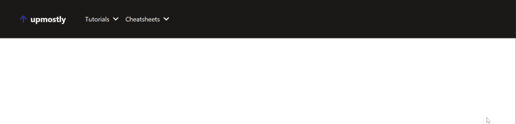
Let’s try building a common use case for the Component API, passing a theme around the app. We’ll be using this to build a little mockup of the Upmostly nav bar you’ll see on the home page:
We’ll set up our Context helper functions:
export const ThemeContext = createContext<'light' | 'dark'>('light');

export function useTheme() {
    return useContext(ThemeContext);
}

export function ThemeContextProvider({
    children,
    value,
}: WithChildrenProps & { value: 'light' | 'dark' }) {
    return (
        <ThemeContext.Provider value={value}>{children}</ThemeContext.Provider>
    );
}
I’m using TypeScript in my Next.js app, so I’ve provided types for createContext and my context provider props.
Firstly we’ll raise our Context Provider up to “_app.tsx”, so that our whole app has access to the context value:
function MyApp({ Component, pageProps }: AppProps) {
    return (
        <ThemeContextProvider value="light">
            <Component {...pageProps} />
        </ThemeContextProvider>
    );
}
I’m going to start off here with the code without using the Context API:
export default function ContextPage() {
    const theme = 'dark';
    return (
        <div className="flex h-screen w-full flex-col items-center justify-start">
            <NavBar theme={theme} />
        </div>
    );
}

type ThemeProps = { theme: 'light' | 'dark' };

function NavBar({ theme }: ThemeProps) {
    return (
        <nav
            className={clsx(
                'flex h-24 w-full flex-row items-center justify-start gap-12 p-12 shadow',
                theme === 'dark' && 'bg-stone-900'
            )}>
            <Logo theme={theme} />
            <Links theme={theme} />
        </nav>
    );
}

function Logo({ theme }: ThemeProps) {
    return (
        <div
            className={clsx(
                'flex flex-row items-center justify-center gap-2 text-xl font-bold',
                theme === 'dark' && 'text-stone-50'
            )}>
            <FaArrowUp className="text-indigo-800" />
            upmostly
        </div>
    );
}

function Link({ link, theme }: { link: string } & ThemeProps) {
    return (
        <li
            className={clsx(
                'flex flex-row items-center justify-center gap-2',
                theme === 'dark' && 'text-stone-50'
            )}>
            {link}
            <FaChevronDown />
        </li>
    );
}

function Links({ theme }: ThemeProps) {
    const links = ['Tutorials', 'Cheatsheets'];
    return (
        <ul className="flex flex-row gap-4">
            {links.map((l) => (
                <Link key={l} link={l} theme={theme} />
            ))}
        </ul>
    );
}
We have some simple components to make up our nav bar, with the help of some styling from TailwindCSS. The component tree looks like this:
- ContextPage
- Logo
- Links
- Link
So in our worst case scenario, we’re passing the theme prop through two levels of prop drilling. In fact inside the Links component we aren’t even using the theme prop, but we still have to pass it through, since it’s used in its child component.
Now let’s refactor this to use the context API.
In our ContextPage we can change it to use the theme from our context value, and skip passing the prop to the NavBar:
export default function ContextPage() {
    const theme = useTheme();
    return (
        <div className="flex h-screen w-full flex-col items-center justify-start">
            <NavBar />
        </div>
    );
}
In our NavBar we no longer need any props at all:
function NavBar() {
    const theme = useTheme();
    return (
        <nav
            className={clsx(
                'flex h-24 w-full flex-row items-center justify-start gap-12 p-12 shadow',
                theme === 'dark' && 'bg-stone-900'
            )}>
            <Logo  />
            <Links  />
        </nav>
    );
}
And the same for our logo:
    const theme = useTheme();
    return (
        <div
            className={clsx(
                'flex flex-row items-center justify-center gap-2 text-xl font-bold',
                theme === 'dark' && 'text-stone-50'
            )}>
            <FaArrowUp className="text-indigo-800" />
            upmostly
        </div>
    );
}
Links no longer needs to care about what the value of theme is:
function Links() {
    const links = ['Tutorials', 'Cheatsheets'];
    return (
        <ul className="flex flex-row gap-4">
            {links.map((l) => (
                <Link key={l} link={l} />
            ))}
        </ul>
    );
}
Since the Link component can directly access the value from Context:
function Link({ link }: { link: string }) {
    const theme = useTheme();
    return (
        <li
            className={clsx(
                'flex flex-row items-center justify-center gap-2',
                theme === 'dark' && 'text-stone-50'
            )}>
            {link}
            <FaChevronDown />
        </li>
    );
}
Overriding
Another cool feature of the Context API is that there’s nothing limiting you to one provider. A component will use the closest provider, e.g. in this case:
function TwoProviders() {
    return (
        <ThemeContextProvider value="light">
            <ThemeContextProvider value="dark">
                <Child/>
            </ThemeContextProvider>
        </ThemeContextProvider>
    );
}
The value Child will see is “dark”, not light.
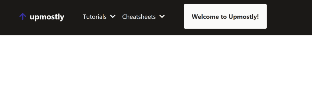
This means we can do some clever things by overriding context in certain scenarios, e.g. a component that will always be in light mode, or create a component where its children are always the opposite theme:
function Inverted({ children }: WithChildrenProps) {
    const theme = useTheme();
    const invertedTheme = theme === 'dark' ? 'light' : 'dark';
    return (
        <ThemeContextProvider value={invertedTheme}>
            {children}
        </ThemeContextProvider>
    );
}
Let’s create a little greeting message to use this in:
function Greeting() {
    const theme = useTheme();
    return (
        <div
            className={clsx(
                'rounded p-5 font-bold',
                theme === 'dark'
                    ? 'bg-stone-800 text-stone-50'
                    : 'bg-stone-50 text-stone-800'
            )}>
            Welcome to Upmostly!
        </div>
    );
}
And then we can add this in to our Nav Bar like this:
function NavBar() {
    const theme = useTheme();
    return (
        <nav
            className={clsx(
                'flex h-24 w-full flex-row items-center justify-start gap-12 p-12 shadow',
                theme === 'dark' && 'bg-stone-900'
            )}>
            <Logo />
            <Links />
            <Inverted>
                <Greeting />
            </Inverted>
        </nav>
    );
}
And since the component is inside our Inverted component, here’s the end result:
Conclusion
Thanks for reading! The Context API is an extremely helpful feature in Next.js that lets you break up your app, and avoid issues like prop drilling. With the help of the Context API, we can simplify our code, increase performance, and improve the user experience of our applications. If you liked this article, you might be interested in looking at context in vanilla React, or how the Context API can be used for state management.
Feel free to leave a comment below if you had any issues, or if you enjoyed the content!
💬 Leave a comment