Most modern web applications today use complex color palettes, style guidelines, styling patterns, as well as many other methodologies and concepts in order to provide visually-stunning user interfaces which are not only pleasant to look like but are also intuitive due to the positioning of certain UI elements and the color schemes used.
However, the issue most modern websites have come to try to resolve is that of the structure and complexity of the stylesheets used to deliver those stunning interfaces.
Today we’ll look at one effective solution when dealing with stylesheet complexity: CSS Modules.
What are CSS Modules?
CSS modules are a way for us to modularize our stylesheets by splitting them into different files without having to worry about naming clashes and side effects caused by multiple stylesheets affecting the same elements (Local scoping).
They are even a viable alternative to methodologies such as BEM or SMACSS.
The CSS within a CSS module is no different from normal CSS, the sole difference lies in the extension of the file that’s marked to highlight that a certain file will be processed.
A CSS module file name would look something like sample-css-module-file.module.scss.
How are CSS Modules used?
Apart from the file naming difference between normal CSS files and CSS Modules files, there’s also a slight difference in the way either is imported into a React component, as well as how it is used to style React components.
Whereas with regular CSS stylesheets we would simply import the stylesheet file and that would have been it, with Modules, on the other hand, we will actually import an object that’s going to be used to bind CSS Modules selectors to elements from JSX.
The above might sound a bit confusing, so why don’t we take a look at a practical example of how we would use CSS Modules?
Building a Card Component
Let’s say we want to build an application where we wish to show a list of speakers at an event and we want to do so by creating a list of cards containing some simple information about them.
We can do so by making use of a simple card component, which will show the full/display name of an event speaker, as well as a short bio of the speaker. Both of those values will be passed down as props.
You will notice the differences we’ve been talking about in the src/components/Card.jsx component:
import styles from './Card.module.css';

const Card = ({ displayName, bio }) => (
  <div className={styles.card}>
    <h4 className={styles['display-name']}>{displayName}</h4>
    <p className={styles.bio}>{bio}</p>
  </div>
);

export default Card;
While the CSS file would look like something you’ve worked with before:
.card {
  width: 400px;
  height: 150px;
  border: 1px solid #333;
  border-radius: 12px;
  text-align: left;
  box-sizing: border-box;
  padding: 0.5rem;
}

.card:not(:last-of-type) {
  margin-bottom: 1.5rem;
}

.display-name {
  color: #4a4a4a;
  margin: 0 0 1rem 0;
  font-size: 1.25rem;
}

.bio {
  color: #a0a0a0;
  font-size: 0.9rem;
  font-weight: 500;
  margin: 0;
}
And now that you’ve seen the syntax for CSS Modules implementation it should make more sense for why we’re importing an object and what the properties of the object mean.
To put it simply, each CSS Module selector that we’re using is expected a binding within React’s JSX, which you can notice by skimming through the code above.
We’ll also list all of the cards inside our root App.js file, which would look something like this:
import './App.css';
import Card from './components/Card';
function App() {
return (
<div
className="App"
style={{
display: 'flex',
flexDirection: 'column',
alignItems: 'center',
marginTop: '1.5rem'
}}
>
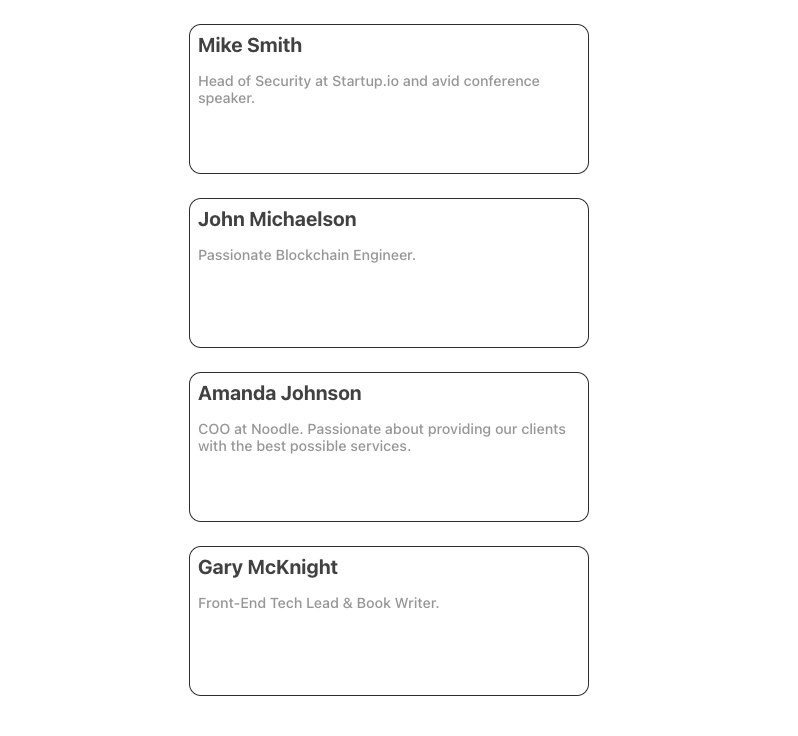
<Card
displayName={'Mike Smith'}
bio={'Head of Security at Startup.io and avid conference speaker.'}
/>
<Card
displayName={'John Michaelson'}
bio={'Passionate Blockchain Engineer.'}
/>
<Card
displayName={'Amanda Johnson'}
bio={'COO at Noodle. Passionate about providing our clients with the best possible services.'}
/>
<Card
displayName={'Gary McKnight'}
bio={'Front-End Tech Lead & Book Writer.'}
/>
</div>
);
}
export default App;And that will render us the following:
However, we’re not limited to only using those selectors, as we can also make use of the CSS nature of the CSS Modules and simply add a ruleset affecting an element or any other selector as we would do in any other CSS file.
For example, if we were to change the color of all the paragraphs in our application to red, we could do the following from our Card.module.css file:
p {
  color: red!important; /* Note that we are using `!important` due to the specificity of the `p.bio` selector */
}
And this will actually work just fine:

Usually, you won’t need to do that, and neither should you, as that’s outside the scope and goal of what CSS Modules hope to achieve, as that will cause side effects or leaks.
Takeaways
I mentioned at the beginning of the article that CSS Modules could be a viable alternative to common CSS methodologies such as BEM or SMACSS; however, that is usually the case with smaller applications, where the stylesheets are not as extensive or complex.
The exception comes when dealing with large applications where components might get bigger and more complex, and that might be reflected in the stylesheets of those components as well. When you find yourself dealing with nested elements it might be a good idea to enhance your modules with an appropriate naming convention in order to improve readability.
If for whichever reason you cannot implement a naming convention for your project, maybe due to inconsistencies with the rest of the codebase, or any other reason, you might want to consider reducing the size of the already existing components in order for the modules selectors’ names to make sense at all times.
If you’d like to also look into other ways to style your application apart from Modules, you can check out this article.
Summary
I hope you’ve enjoyed reading this article and you’ve got a better understanding of what CSS Modules are, what they are used for, how are they used, and hopefully you’ve got a bit more insight into how you should use them properly in your React projects.
If you’d like to open a discussion based on this topic, feel free to leave a comment below this article and we’ll debate further 😉. If you’d like to leave any feedback or criticism on the article, feel free to do so by leaving a comment below as well.
See you at the next one. Cheers!
💬 Leave a comment