Building modal dialogs in React is a challenge due to their architectural and accessibility complications. However, there is an easy solution.
Modal Dialogs in React are Complicated
React’s design and architectural best practices mean modal dialogs require more effort than throwing together a simple component.
To create a good modal component in React, we should:
- Append modals to the end of the DOM body property, for accessibility reasons. This is not typical in React as components are mounted inside the uppermost parent component.
- Wait to mount
modals to the DOM until they are shown. - Remove
modals from the DOM when they are hidden. - Not manipulate the DOM directly, using libraries like jQuery to show and hide elements.
What We’re Building
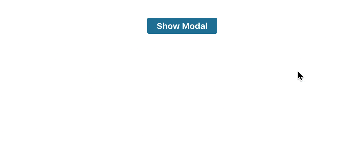
I’m going to show you how to build a modal dialog component in React that shows and hides at the click of a button. By the end of this tutorial, you’ll have a modal that looks like this:
Creating a Custom Modal Hook
We’re going to start by creating a custom React Hook to power our modal component. If you haven’t already explored React Hooks, check out my Simple Introduction to React Hooks.
A Hook in React is a function that shares common logic between multiple components. For example, showing and hiding a react modal component.
Start by creating a new file named useModal.js. Always prefix Hooks with use, followed by the name of the Hook.
import { useState } from 'react';

const useModal = () => {
  const [isShowing, setIsShowing] = useState(false);

  function toggle() {
    setIsShowing(!isShowing);
  }

  return {
    isShowing,
    toggle,
  }
};

export default useModal;
We do a few things in the custom Hook above:
- Instantiate new
isShowing and setIsShowing state values to store the current view state of the modal. - Declare a function toggle that changes the value of
isShowing to be the opposite of what it is currently. - Return the value of
isShowing and the toggle function from the Hook, so the component has access to them.
Creating the Modal React Component
Now that we have the custom Hook ready to use, let’s create the actual modal component that we wish to render.
import React from 'react';
import ReactDOM from 'react-dom';
const Modal = ({ isShowing, hide }) => isShowing ? ReactDOM.createPortal(
<React.Fragment>
<div className="modal-overlay"/>
<div className="modal-wrapper" aria-modal aria-hidden tabIndex={-1} role="dialog">
<div className="modal">
<div className="modal-header">
<button type="button" className="modal-close-button" data-dismiss="modal" aria-label="Close" onClick={hide}>
<span aria-hidden="true">×</span>
</button>
</div>
<p>
Hello, I'm a modal.
</p>
</div>
</div>
</React.Fragment>, document.body
) : null;
export default Modal;
Most of the code above is self-explanatory. Modal is a stateless functional component that takes two props and only returns HTML when isShowing is true.
However, take a look at the code that wraps the Modal child elements, especially the end of the first line.
const Modal = ({ isShowing, hide }) => isShowing ? ReactDOM.createPortal(
  <React.Fragment>
    ...
  </React.Fragment>, document.body
) : null;
What on earth is a Portal?!
A Portal to Another DOM-Ension
Other than sounding really cool, Portals allow React components to render in another part of the DOM that is outside of their parent component.
Therefore, we can use a Portal to mount our Modal component to the end of the document
To do this in the code above, we specify two arguments to the
Using the Modal React Component
Finally, let’s tie the custom React Modal Hook and the Modal component together.
import React from 'react';
import './App.css';
import Modal from "./Modal";
import useModal from './useModal';

const App = () => {
  const {isShowing, toggle} = useModal();
  return (
    <div className="App">
      <button className="button-default" onClick={toggle}>Show Modal</button>
      <Modal
        isShowing={isShowing}
        hide={toggle}
      />
    </div>
  );
};

export default App;
We import the custom React Hook inside of the component and initializ isShowing and toggle from the Hook.
const {isShowing, toggle} = useModal();Next, we pass toggle into the button’s onClick which sets the value of
<button className="button-default" onClick={toggle}>Show Modal</button>Finally, we pass isShowing and toggle in through the Modal component’s props so we can access them there.
Styling Our React Modal Component
Drop this CSS code into App.css to style the React modal component:
.App {
  text-align: center;
  padding-top: 2rem;
}

.modal-overlay {
  position: fixed;
  top: 0;
  left: 0;
  z-index: 1040;
  width: 100vw;
  height: 100vh;
  background-color: #000;
  opacity: .5;
}

.modal-wrapper {
  position: fixed;
  top: 0;
  left: 0;
  z-index: 1050;
  width: 100%;
  height: 100%;
  overflow-x: hidden;
  overflow-y: auto;
  outline: 0;
}

.modal {
  z-index: 100;
  background: white;
  position: relative;
  margin: 1.75rem auto;
  border-radius: 3px;
  max-width: 500px;
  padding: 2rem;
}

.modal-header {
  display: flex;
  justify-content: flex-end;
}

.modal-close-button {
  font-size: 1.4rem;
  font-weight: 700;
  line-height: 1;
  color: #000;
  opacity: .3;
  cursor: pointer;
  border: none;
}

button {
  font-size: .9rem;
  font-weight: 700;
  border: none;
  border-radius: 3px;
  padding: .3rem 1rem;
  margin-left: .5rem;
}

.button-default {
  background: #247BA0;
  color: #fff;
}
If you need to add a file upload in a modal, check out my tutorial Upload a File from a React Component.
Wrapping Up
See, I told you there was a simpler solution for creating modal dialogs in React. Now that you have a custom modal Hook, you can extend the same modal logic to multiple different types and styles of modals.
If you’re interested in an even easier solution, I’ve released a React modal library called
- ⭐️A clean, easy to understand interface for creating and customizing modal dialogs
- Two ready to use components, a Modal and a Button
- Use your own components to customize the modal however you want
- Responsive design
- ⚛️Support for React v16.8+ and Hooks
- Declarative, React Hooks syntax
- ♿️Conforms to WAI-ARIA accessibility modal dialog specifications
Check out
Until next time!
💬 Leave a comment