Hey there! If you’re a web developer, you know that navigation bars are a crucial part of any website.
In this article, I’ll show how you how to build a nav bar in Next.js, from setting up your project to creating components styling with TailwindCSS, and animations with Framer Motion.
Setting Up
First, we’ll need to set up our Next.js project. You can go ahead and use this template, or start from scratch with a new project using:
npx create-next-app@latest --typescriptThe Basics
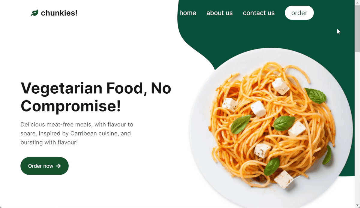
Just for reference, here’s the design we’ll be working with:
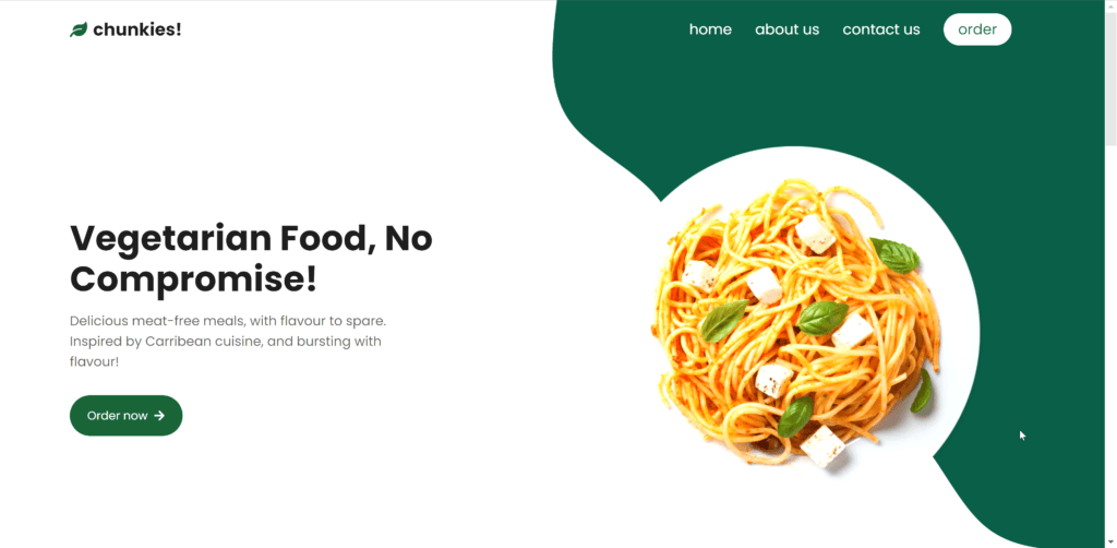
A simple nav bar for a fictional restaurant landing page.
We’ll go through building this component from top to bottom. Here’s the outline for our component:
export function NavBar() {

    return (
        <motion.nav
            className="sticky top-0 z-10 flex h-20 w-full items-center justify-between px-8 font-title text-3xl lg:px-24 lg:text-2xl ">
            <Logo />
            <NavLinks />
        </motion.nav>
    );
}
(You might notice some of our elements are Framer Motion elements, this will be useful later). We have a simple flexbox, spreading our three sections across our page horizontally. Now let’s drill into the components:
Logo
function Logo() {
    return (
        <div className="flex w-fit items-center justify-center gap-2">
            <FaLeaf className="text-primary" />
            <div className="font-bold">chunkies!</div>
        </div>
    );
}
Here I’ve made the logo from scratch; in a real app, this might be an SVG or an image.
Links
Next up we have our nav links:
function NavLinks({ inverted }: { inverted: boolean }) {
    return (
        <motion.div
            className={clsx(
                'flex items-center gap-8 px-8 text-xl transition-all',
                inverted ? 'text-primary' : 'text-white'
            )}>
            <NavLink href="#home">home</NavLink>
            <NavLink href="#about">about us</NavLink>
            <NavLink href="#contact">contact us</NavLink>
            <NavLink
                className={clsx(
                    'rounded-full px-5 py-2 transition-all',
                    inverted ? 'bg-primary text-white' : 'bg-white text-primary'
                )}>
                order
            </NavLink>
        </motion.div>
    );
}
You might notice our NavLinks component takes an inverted prop, we’ll be using this later when we add in some animation for our nav bar.
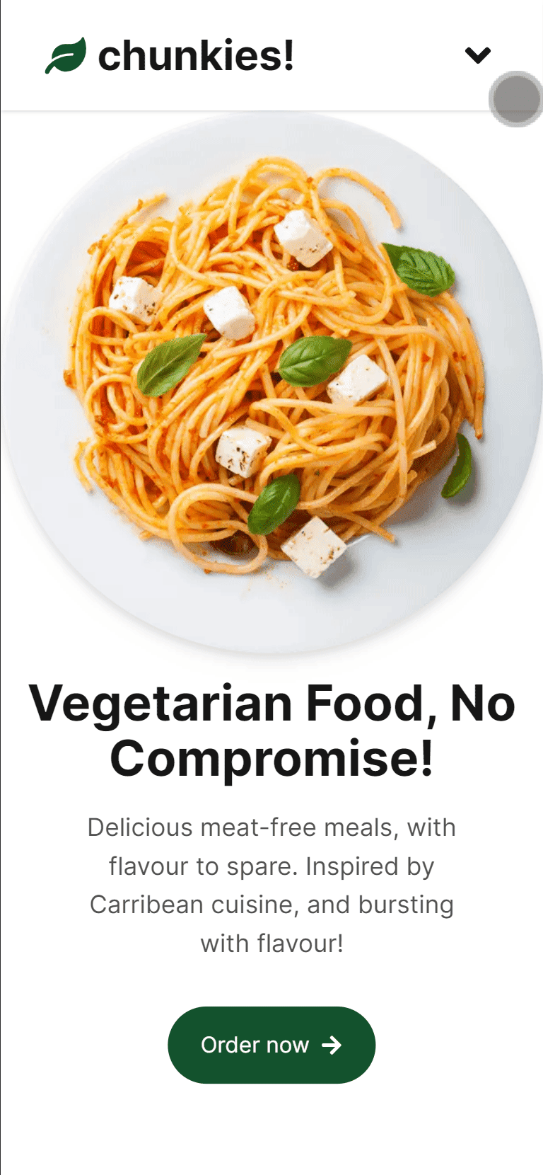
Mobile
Our current nav design doesn’t quite scale to mobile as well as we’d like it to. Let’s build a new nav menu specifically for mobile:
function NavBarMobile() {
    const [open, setOpen] = useState(false);
    const toggleOpen = () => setOpen((o) => !o);
    return (
        <motion.nav className="sticky top-0 z-10 flex w-full flex-col items-center justify-between font-title text-3xl">
            <div className="flex h-20 w-full items-center justify-between bg-white px-8 shadow">
                <Logo />
                <button onClick={toggleOpen}>
                    {open ? <FaAngleUp /> : <FaAngleDown />}
                </button>
            </div>

                {open && (
                    <motion.div
                        className="flex w-full flex-col gap-4 bg-stone-100 p-8"

                        key={open ? 'open' : 'closed'}>
                        <NavLink href="#home">home</NavLink>
                        <NavLink href="#about">about us</NavLink>
                        <NavLink href="#contact">contact us</NavLink>
                        <NavLink
                            className={clsx(
                                'flex items-center justify-center rounded px-5 py-2 transition-all',
                                'bg-primary text-white'
                            )}>
                            order
                        </NavLink>
                    </motion.div>
                )}
            </AnimatePresence>
        </motion.nav>
    );
}
The first thing to handle is opening/closing the menu. This is done through storing whether or not the menu is open in state, and we’re toggling it through a button element. Then we can use conditional rendering to hide/show our menu items, as well as change the icon for our button. With that, here’s what we get:

Which isn’t bad! But it’s a little jarring with our menu popping in and out. So let’s add in our animation with Framer Motion:
const menuVariants: Variants = {
    hide: { scaleY: 0 },
    show: { scaleY: 1 },
};
function NavBarMobile() {
    const [open, setOpen] = useState(false);
    const toggleOpen = () => setOpen((o) => !o);
    return (
        <motion.nav className="sticky top-0 z-10 flex w-full flex-col items-center justify-between font-title text-3xl">
            <div className="flex h-20 w-full items-center justify-between bg-white px-8 shadow">
                <Logo />
                <button onClick={toggleOpen}>
                    {open ? <FaAngleUp /> : <FaAngleDown />}
                </button>
            </div>
            <AnimatePresence mode="sync">
                {open && (
                    <motion.div
                        className="flex w-full flex-col gap-4 bg-stone-100 p-8"
                        layout
                        initial="hide"
                        animate="show"
                        exit="hide"
                        style={{ originY: 0 }}
                        key={open ? 'open' : 'closed'}>
                        <NavLink href="#home">home</NavLink>
                        <NavLink href="#about">about us</NavLink>
                        <NavLink href="#contact">contact us</NavLink>
                        <NavLink
                            className={clsx(
                                'flex items-center justify-center rounded px-5 py-2 transition-all',
                                'bg-primary text-white'
                            )}>
                            order
                        </NavLink>
                    </motion.div>
                )}
            </AnimatePresence>
        </motion.nav>
    );
}
Firstly we set up our animations, in our case we’ll make the menu options slide in and out by scaling them.
Then we set these animations to run whenever our component is mounted/unmounted. And here’s our end result:
The final step is to handle changing between our two navigation menus. I’m going to do this in JavaScript rather than with CSS, to avoid having to render both components. Let’s refactor our NavBar component to pick between them:
export function NavBar() {
    const md = useMediaQuery('md');
    if (md) return <NavBarDesktop />;
    return <NavBarMobile />;
}
I’m using a custom hook to check if the screen size matches a media query, which you can check out the code for here.
Animation
So now we have our nav bar, and it scales nicely from desktop to mobile. Now let’s add in some animation.
I’m going to be implementing some animations you may have seen in a lot of nav bars online:
- Adding a background to our nav bar when we scroll past the start of the page
- Hiding the nav bar when we’re scrolling down
Here’s our updated component:
function NavBarDesktop() {
    const { scrollYProgress } = useScroll();
    const [atPageStart, setAtPageStart] = useState(true);
    const [scrollingUp, setScrollingUp] = useState(true);

    useMotionValueEvent(scrollYProgress, 'change', (v) => {
        setAtPageStart(v < 0.05);
        setScrollingUp(v < 0.25 || scrollYProgress.getVelocity() < 0);
    });

    return (
        <motion.nav
            className="sticky top-0 z-10 flex h-20 w-full items-center justify-between px-8 font-title text-3xl lg:px-24 lg:text-2xl "
            variants={containerVariants}
            animate={[
                atPageStart ? 'transparent' : 'solid',
                scrollingUp ? 'show' : 'hidden',
            ]}
            layout>
            <Logo />
            <NavLinks inverted={!atPageStart} />
        </motion.nav>
    );
}
Our first change is keeping track of our two states. If we’re at the top of the page, and if we’re scrolling upwards:
    const { scrollYProgress } = useScroll();
    const [atPageStart, setAtPageStart] = useState(true);
    const [scrollingUp, setScrollingUp] = useState(true);

    useMotionValueEvent(scrollYProgress, 'change', (v) => {
        setAtPageStart(v < 0.05);
        setScrollingUp(v < 0.25 || scrollYProgress.getVelocity() < 0);
    });
Then inside our element, if we’re at the start we make our background transparent, and if we’re scrolling up, we hide it completely:
    return (
        <motion.nav

...
            animate={[
                atPageStart ? 'transparent' : 'solid',
                scrollingUp ? 'show' : 'hidden',
            ]}
...
        </motion.nav>
    );
And here’s our end result:
Conclusion
Thanks for reading! Check out the full code for this app here for a further deep dive. You might also be interested in this article on how to build a nav menu in vanilla React. If you liked this article, feel free to leave a comment below!
💬 Leave a comment