
Dropdown menus allow you to declutter a web app and make navigation clean and intuitive. They allow you to fit dozens of potential selections within a small set of dropdown items.
Building a React dropdown menu is a great way to learn React, so let’s get started!
Building the Base Button
We’ll first set up the structure for our dropdown menu. We have a very standard index.js:
import React from 'react';
import ReactDOM from 'react-dom';
import './index.css';
import App from './App';

ReactDOM.render(

 <App/>
  ,
  document.getElementById('root')
);
Within index.js, we call the App component. We define this component in App.js:
import { Dropdown } from './Dropdown.js'
import { Element } from './Element.js';

function App() {

  return (

    <>
    <Dropdown />
    <Element />
    </>


  )

}

export default App;
App.js calls two other components, Dropdown and Element. For now we’ll use a barebones “Hello World” example for both (we will revise later).
In Dropdown.js:
function Dropdown( props ) {

    return (

        <div>

            Hello World

            { props.children }

        </div>

    )

}

export { Dropdown }
Notice how we use ‘{ props.children }’ to reference the three elements within the Dropdown element in the JSX. Now, for the elements themselves, within Element.js:
function Element() {

    return (

        <div>

            World

        </div>

    )

}

export { Element }
All the above code does is render the word “World”. When we run the app, we get the following in the browser:
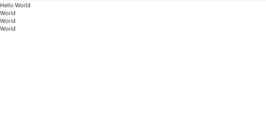
It’s a very simple output, but we’re just about to add some very cool functionality!
Toggling the Menu Button
Now that we’ve got the basic structure of the dropdown element, let’s add the ability to toggle it on and off. Currently, it’s just a static page.
To enable the dropdown to be toggled, we’ll modify the element in Dropdown.js:
import { useState } from 'react';

function Dropdown( props ) {

    const [ display, setDisplay ] = useState( 'none' )

    function handleClick() {

        if ( display == 'none' ) {

            setDisplay( 'block' )

        } else {

            setDisplay( 'none' )

        }

    }

    return (

        <div>

            <div>

                Hello World

            </div>

            <div style={{display:display}}>

                { props.children }

            </div>

        </div>

    )

}

export { Dropdown }
In the code above, we’ve done a few things.
First, we use the useState hook to set the variable ‘display’ and the function to set it, setDisplay. This allows us to toggle and update the dropdown display each time the dropdown element is clicked.
Next, we’ve wrapped the “Hello World” within a div with an onClick attribute. We set it to the handleClick function.
When handleClick gets called, we use the setDisplay from our useState hook to toggle the display variable to either ‘none’ or ‘block’ (when the element is clicked, the display variable will be set to the string that’s currently not being used). ‘none’ and ‘block’ are CSS settings for the ‘display’ attribute; the former makes an element invisible in the rendering while the latter shows the element to the screen.
Since setDisplay automatically sets the ‘display’ variable and re-renders the screen (due to the useState hook), we can now set the ‘style’ attribute of the div surrounding ‘{props.children}’ to an object containing our setting for the ‘display’ attribute, our variable ‘display’. We are now able to click on the “Hello World” to toggle the menu on:
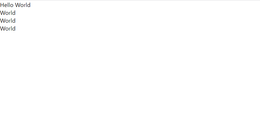
And off:

Now that we’ve added toggling functionality to our dropdown menu, we need to style our components to make them fit into any modern web app.
Styling our Components
To style our components with best practices, we should change the ‘divs’ we’ve been using in our JSX to React components that can hold CSS attributes in a modular way.
In Dropdown.js:
import { useState } from 'react';
import { DropdownButton } from './DropdownButton.js';

function Dropdown( props ) {

    const [ display, setDisplay ] = useState( 'none' )

    function handleClick() {

        if ( display == 'none' ) {

            setDisplay( 'block' )

        } else {

            setDisplay( 'none' )

        }

    }

    return (

        <div>


            <div style={{display:display}}>

                { props.children }

            </div>

        </div>

    )

}

export { Dropdown }
All we’ve done in the above code is switch the Hello World button to a React element, passing the text “Hello World” as part of the props.
Now, we’ll style the DropdownButton.
We’ll add the following styles to our CSS file:
.DropdownButton {

  color: white;

  background-color: blue;
  border-radius: 5px;

  padding: 5px;

  width: max-content;

}

.noselect {

  -webkit-touch-callout: none;
    -webkit-user-select: none;
     -khtml-user-select: none;
       -moz-user-select: none;
        -ms-user-select: none;
            user-select: none;

}
The above code defines the styles for our DropdownButton, setting the text color to white, the background color to blue, and the border radius (the size of the rounded edges) to 5px. We also add padding to ensure that the border has some space around the inner text, and we set the width to ‘max-content’ to wrap the button only around the text present (by default, the button will occupy the entire horizontal length of the window that it is given).
The ‘noselect’ class is pretty simple — all it does is prevent itself from being selected on a double-click. This is useful to make buttons cleaner to interact with — we wouldn’t want a user selecting the text within the button, as it is meant as just a label rather than the actual content of the page.
With our styles defined, we’ll head over to DropdownButton.js:
function DropdownButton( props ) {

    var content = props.content;

    var handleClick = props.onClick;

    return (

        <div>

            <div>

                { content }

            </div>

        </div>

    )

}

export { DropdownButton }
The above code defines our DropdownButton component, setting a few className’s in the process to apply the styles we defined above. Notice that the onClick function get passed in as a prop, and must be set in the ‘div’ that we return.
Now, let’s style the elements that drop down in our menu.
We’ll first add a very similar class to our existing DropdownButton to our CSS file:
.DropdownElement {

  color: white;

  background-color: green;
  border-radius: 5px;

  padding: 5px;

  width: max-content;

}
Now, in DropdownElement.js:
function Element( props ) {

    var content = props.name

    return (

        <div>

            <div>

                { content }

            </div>

        </div>

    )

}

export { Element }
And back in App.js:
import { Dropdown } from './Dropdown.js'
import { Element } from './Element.js';

function App() {

  return (

  <>
  <Dropdown>
  <Element/>
  </Dropdown>
  </>


  )

}

export default App;
In the code above, we pass in names for each of the elements in our dropdown. The elements can get their names via props, and render them in the ‘div’ that they return.
In our Element element, we also set the CSS style we defined above via ‘className’.
Conclusion
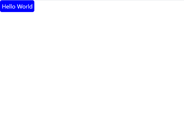
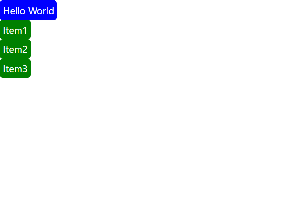
When we run our code, we get the following dropdown menu:
When not toggled:
When toggled:
From here, there are endless possibilities for making this dropdown menu fit into a specific web app. With the basic structure outlined in this tutorial, you should be able to add on functionality pretty easily.
That’s all for now! Please leave any questions or comments below.
💬 Leave a comment