In the world of web development, creating a dynamic and user-friendly interface is key to delivering a great user experience.
One way to achieve this is by implementing an accordion menu, allowing for a clean and organized content display. In this article, we will explore the process of building a custom accordion menu using pure JavaScript.
Prerequisites
- Fundamental knowledge of HTML and CSS
- Fundamentals of JS and JS DOM manipulation
- A code editor and a browser (e.g, Google Chrome).
What is an Accordion Menu
An accordion menu is a UI element that displays collapsible sections of content, where only one section can be open at a time. It helps to present information in a compact and organized manner.
Accordion menus serve a ton of uses on our web pages, such as:
- Space-saving: Accordions help to save space on a web page by allowing multiple sections of content to be hidden behind a single header.
- Improved UX: Accordions provide a clear and intuitive way for users to access and navigate through different sections of content, improving the overall user experience.
- Dynamic Content Display: Accordions allow for dynamic content display, enabling web developers to present information in a compact and organized manner, making it easier for users to find what they are looking for.
Project Breakdown
Before we start working on our project, it’s important to know that it has two parts:
- The interface section – consists of HTML markup and CSS that is used to style the accordion menu.
- The functionality section – adds some dynamic functionality using JavaScript.
By the end of this article, you’ll have a modern accordion menu, and you’ll know how to make one yourself. So, roll up your sleeves, and let’s make an accordion menu that will make your website stand out!
The Interface Section
This interface section consists of all the markup and styling we need for our menu.
HTML
This is the HTML markup we are going to need for the project:
<ul class="accordion-menu">
<li>
<div class="dropdownHeader">
<i class="fa-solid fa-code"></i>
<span>Programming Languages</span>
<i class="fa fa-chevron-down" aria-hidden="true"></i>
</div>
<ul class="submenuItems">
<li>
<a href="#">JavaScript</a>
</li>
<li>
<a href="#">Python</a>
</li>
<li>
<a href="#">C++</a>
</li>
</ul>
</li>
<li>
<div class="dropdownHeader">
<i class="fa-solid fa-pen-fancy"></i>
<span> UI/UX</span>
<i class="fa fa-chevron-down"></i>
</div>
<ul class="submenuItems">
<li>
<a href="#">Adobe XD</a>
</li>
<li>
<a href="#">Figma</a>
</li>
<li>
<a href="#">Sketch</a>
</li>
<li>
<a href="#">InVision Studio</a>
</li>
</ul>
</li>
<li>
<div class="dropdownHeader">
<i class="fa-regular fa-file-word"></i>
<span> Technical Writing </span>
<i class="fa fa-chevron-down" aria-hidden="true"></i>
</div>
<ul class="submenuItems">
<li>
<a href="#">Hashnode</a>
</li>
<li>
<a href="#">Medium</a>
</li>
<li>
<a href="#">FreeCodeCamp</a>
</li>
</ul>
</li>
<li>
<div class="dropdownHeader">
<i class="fa-solid fa-people-group"></i>
<span> Social Media </span>
<i class="fa fa-chevron-down" aria-hidden="true"></i>
</div>
<ul class="submenuItems">
<li>
<a href="#">Facebook</a>
</li>
<li>
<a href="#">Twitter</a>
</li>
<li>
<a href="#">Instagram</a>
</li>
</ul>
</li>
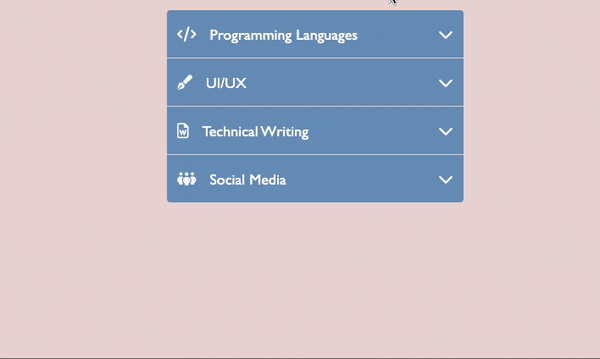
</ul>A lot to take in, right? Let’s go through everything then.
First, we created a parent ul element having the class accordion menu, and it contains 4 li elements. In each of those child elements (li), there are:
- A div with the class dropdown link that acts as a toggler for each part; this div element acts as the trigger for expanding and closing the accordion menu.
Within this div, we have
- The I tag, which has the attractive icon on our left.
- The span tag, which holds the name of the menu.
- The I tag with the class fa fa-chevron-down, which is used as an indication for the accordion menu, indicating whether it is expanded or collapsed.
- An unordered list (ul) having the class submenu item. This ul element holds the items that will be shown when the accordion menu is extended. A li tag represents each item. However, the content of this concealed part may be anything, such as photos, extensive text, list items, and so on, but for the sake of this article, we will stick to it is a list item.
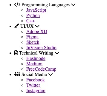
The HTML markup looks like this without any style attached.
CSS
Then, for the CSS, we have the following code:
* {
  margin: 0;
  padding: 0;
}

body {
  font-family: 'Gill Sans', 'Gill Sans MT', Calibri, 'Trebuchet MS', sans-serif;
  background: #ead7d7;
}

ul {
  list-style: none;
}

a {
  text-decoration: none;
}

.accordion-menu {
  width: 100%;
  max-width: 350px;
  margin: 1rem auto;
  background: #6f95bc;
  border-radius: 4px;
}

.accordion-menu li.active .dropdownHeader {
  color: #ffffff;
  background: #163e67;
}

.accordion-menu li.active .dropdownHeader .fa-chevron-down {
  transform: rotate(180deg);
}

.accordion-menu li:last-child .dropdownHeader {
  border-bottom: 0;
}

.dropdownHeader {
  cursor: pointer;
  display: block;
  padding: 12px;
  font-size: 18px;
  border-bottom: 1px solid #ead7d7;
  color: #ffffff;
  position: relative;
  transition: all 0.4s ease-out;
  display: flex;
  align-items: center;
  height:2rem ;
  column-gap: 1rem;
}

.dropdownHeader .fa-chevron-down {
  position: absolute;
  right: 12px;
}

.submenuItems {
  display: none;
  background: #80a7ce;
  transition: 3s ease-in-out;
  animation: anime 0.4s ease-in;
  font-family: monospace;
  font-size: 1rem;
}

@keyframes anime {
  0%{transform:translateY(-100%);opacity: 0;}
  98%{opacity: 0.2;}
  100%{transform: translateY(0); opacity: 1;}
}

.submenuItems li {
  border-bottom: 1px solid #b6b6b6;
}

.submenuItems a {
  display: block;
  color:#163e67;
  padding: 12px 12px 12px 45px;
  transition: all 1s ease-out;
}

.submenuItems a:hover {
  background-color: #2e5073;
  color:#fff
}
The CSS code starts by setting the overall visual design of the site, including the font and background-colour. We then gave the accordion menu some width, color, and border-radius.
When a certain menu item is clicked and opened, the style changes the appearance of the menu to reflect this. When a link is activated, multiple visual styles are utilized to indicate its state.
Submenu items sliding down on menu opening and link color changing on mouseover behavior are two examples of code animations we added in this project.
In general, this CSS code enhances the aesthetic appeal of the accordion menu and emphasizes which sections are expanded and which are collapsed.
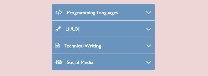
The HTML markup looks like this with the style attached
The Functionality Section
In this section, we’ll go over the behavior of our accordion menu.
Features of our accordion Menu
- Displaying our menu
- Collapsing our menu
To better understand our process, here’s a flowchart of our application
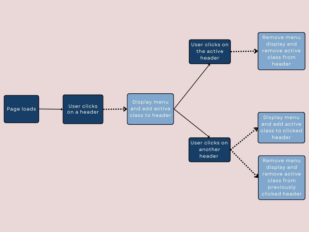
Keep in mind that implementation starts from left to right
Let’s get right into it. As the flow chart demonstrates, it’s a pretty simple application that only consists of a few features, and just by following the steps in this article, putting those features into action will be a snap.
Instead of dumping all of the code all at once, as we did with the interface section for the functionality, we will be doing it step by step so you can understand every bit of detail there is.
First, we create a function that houses all our functionality, and we store it in a variable called accordion, which is called immediately after the page loads:
const accordion = function() {
};

accordion();
Next, we select our DOM elements:
const accordion = document.querySelector(".accordion-menu");
const dropdownHeader = accordion.querySelectorAll(".dropdownHeader");
Handling click on the dropdown header
Recalling that querySelectorAll() returns a nodelist, we use the forEach() method to loop over each entry in the nodelist (header), attaching an event listener for click behavior.
dropdownHeader.forEach((header) => {
   header.addEventListener("click", (e) => {
   });
});
Revealing the Submenu
Now that we’ve accounted for when each of the headers is clicked, let’s deal with revealing the submenu when the header is clicked.
Selecting the Submenu
To begin, you will see that our HTML has both the dropdown header and the submenu in the same parent element. This was done on purpose so we can use the nextElementSibling and parentElement properties.
And as seen below we used the nextElementSibling property to select the submenu
const submenuItem = header.nextElementSibling;Expanding and Collapsing a Menu
To expand the submenu, we can simply use a ternary operator to toggle the style of the submenuItem between display: block and display: none. Then we add the active class to the header, which had its menu expanded.
submenuItem.style.display = submenuItem.style.display === "block" ? "none" : "block";
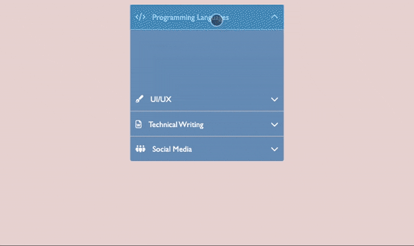
header.parentElement.classList.toggle("active");Let’s look at the progress we have made so far.
Keeping just one link open at a time
A distinct feature of the accordion menu is its ability to maintain only 1 active tab at a time. Let’s implement that, shall we?
To begin, we will modify the accordion function that we developed so that it takes a parameter. Until now, everything in our code has been contained within its block.
const accordion = function(multiple = false) {
}
we added the multiple parameter and set the default value to false, as shown above.
We only need one menu open at a time, which we can do using an if statement since it only executes the code in its block if a specific condition is fulfilled.
if (!multiple) {
}
Initially, the multiple parameter was set to false, but the NOT operator (!) inverts boolean values, causing JavaScript to execute the code in the block.
It’s now time for the code in the if block.
Just like we did for the dropdown header, we use the querySelectorAll() then we use the forEach() method to loop over each entry in the nodelist (i.e., the submenu)
accordion
  .querySelectorAll(".submenuItems")
  .forEach((submenu) => {})
Then we check to see whether the submenu of the clicked header is the same as the submenu of the previously opened header; if not, we collapse the previously opened header’s submenu. Setting the previously opened header submenu display to none is how to do this.
Then, we delete the active class from the previously opened header.
if (submenu !== submenuItem) {
  submenu.style.display = "none";
  submenu.parentElement.classList.remove("active");
}
And that’s all 🎉. Here is what the final result looks like.
Project Links
Source Code: Github
Live Page: URL
Conclusion
In conclusion, we have successfully implemented an accordion menu that allows users to expand and collapse content sections, which helps arrange our content in a clear and easy-to-navigate way.
This accordion menu is built by selecting HTML elements, adding event listeners, and manipulating style and class properties using JavaScript. This is only the beginning, there are many methods to accomplish the same functionality and many designs to make your accordion menu unique.
Understanding the fundamentals of accordion menu development and modifying them for your project is crucial.
I hope you’ve enjoyed the read! Be sure to leave your feedback on this article below!
Cheers!
💬 Leave a comment