Hey there, fellow Next.js enthusiasts! Are you looking to add some visual flair to your web application? Well, you’re in luck! In this article, we’ll dive into the wonderful world of Font Awesome icons and explore how you can integrate them seamlessly into your Next.js projects. So, let’s get started and make your app shine!
React Icons
React Icons is a very useful library that provides access to a large range of SVG icon packs, including FontAwesome. You can install it with:
npm install react-icons --saveThen you can import any icon you need, using:
import { IconName } from "react-icons/fa";One important thing to note is that your IDE may automatically attempt to import the icon from “react-icons/all”, which can cause issues, so you should prefer the first approach:
import { IconName } from "react-icons/all"; //❌
import { IconName } from "react-icons/fa"; //✔️
This provides you access to an icon component, which can then be used in your app, e.g.:
function CloseButton() {
    return (
        <button className="bg-red-500">
            <FaTimes />
        </button>
    );
}
Configuration
There are a few ways to change the look of your icons. For global styling, React Icons provides a Context provider component.
export default function FontAwesome() {
    return (
        <IconContext.Provider value={{ style: { color: 'white' } }}>
            <CloseButton />
        </IconContext.Provider>
    );
}
This value can be inline styling, or class names, e.g. if you’re using TailwindCSS:
export default function FontAwesome() {
    return (
        <IconContext.Provider value={{ className: 'text-white' }}>
            <CloseButton />
        </IconContext.Provider>
    );
}
Alternatively, you can target your icons directly through props, which include all of the native SVG element props. This means you can use inline styles:
function CloseButton() {
    return (
        <button className="bg-red-500">
            <FaTimes style={{color: 'white'}} />
        </button>
    );
}
Or through class names:
function CloseButton() {
    return (
        <button className="bg-red-500">
            <FaTimes className="text-white" />
        </button>
    );
}
Which option you prefer is up to you; as a Tailwind developer, I prefer to target the icon through class names passed directly through props on the component. For you, choose whichever option integrates nicely into your styling solution.
Example
Let’s build a simple form submit button using FontAwesome.
We’ll start off with a reusable IconButton component:
function IconButton({ icon, className, children, onClick }: IconButtonProps) {
    return (
        <button
            className={clsx(
                'flex flex-row items-center justify-center gap-4 rounded p-2 font-bold text-white',
                className
            )}
            onClick={onClick}>
            {children}
            {icon}
        </button>
    );
}
A straightforward component that takes an icon to display alongside some text, as well as an onClick function, and a className to provide it with some styles. There are some styles applied to our button already, but I want to be able to override them when we use this component in a more specific way.
Next, we’ll create our submit button variants:
function Submitted({ toggle }: SubmitVariantProps) {
    return (
        <IconButton
            icon={<FaCheck className="text-green-900" />}
            className="bg-green-500"
            onClick={toggle}>
            Done!
        </IconButton>
    );
}

function NotSubmitted({ toggle }: SubmitVariantProps) {
    return (
        <IconButton
            icon={<FaArrowRight className="text-neutral-900" />}
            className="bg-neutral-500"
            onClick={toggle}>
            Submit
        </IconButton>
    );
}
They’re essentially identical, with some changes to the colours and the component.
Next, we can put this all together:
function SubmitButton() {
    const [submitted, toggleSubmitted] = useReducer((v) => !v, false);
    const Button = submitted ? Submitted : NotSubmitted;
    return <Button toggle={toggleSubmitted} />;
}
In a real-world app you might be tracking the state of some form of API call to submit your data, but in our case, I’ve just used useReducer to create a simple toggle that gets flipped whenever toggleSubmitted is called. Then we show the correct component depending on that state value.
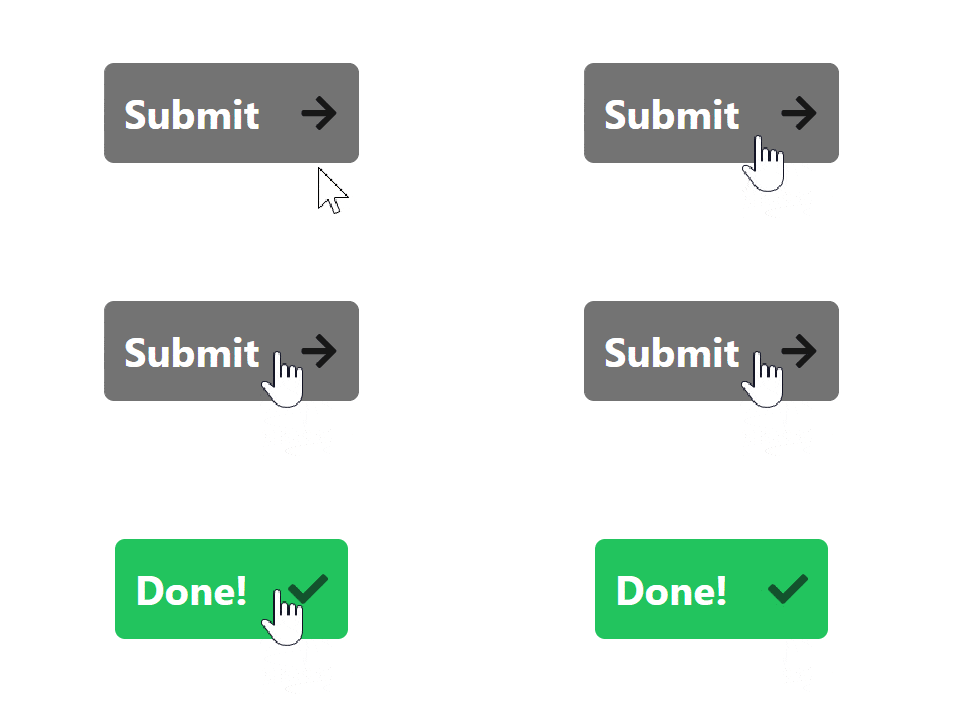
With that all put together, here’s what it looks like:

Perfect! Thanks to React Icons, we’ve successfully and smoothly integrated FontAwesome into our Next.js app.
Conclusion
Thanks for reading! I hope with this article you were able to get set up with the full FontAwesome collection in your Next.js app. If you liked this article, or if you’ve run into any issues, leave a comment below!
💬 Leave a comment