Media queries are used in responsive design. They are used to apply different CSS rules to different types of devices, most commonly screen sizes, but they can also cover other options such as screen orientation, and even whether or not your display supports colour. They can also be accessed through CSS, or programmatically through JavaScript, and in this article, I’ll explain both approaches.
Pure CSS
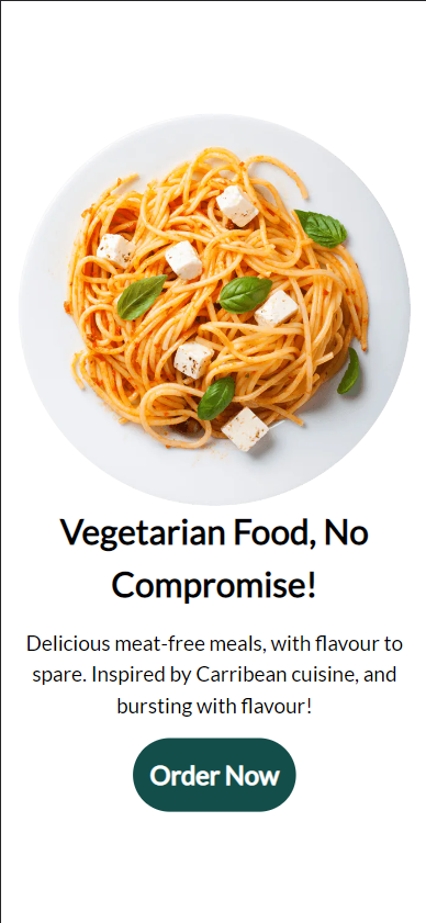
Let’s explore CSS media queries in React through a classic landing page design. I’ve used a simple flexbox to align the items vertically.
function App() {
    const closest = useClosestMedia();
    const query = useMediaQuery('lg');
    return (
        <div className="container">
            <div className="plate-container">
                <img className="plate" src="plate-3.webp" />
            </div>
            <div className="text-container">
                <h1 className="title">Vegetarian Food, No Compromise!</h1>
                <div>
                    Delicious meat-free meals, with flavour to spare. Inspired
                    by Carribean cuisine, and bursting with flavour!
                </div>
                <button className="cta">Order Now</button>
            </div>
        </div>
    );
}
.container {
display: flex;
flex-direction: column;
align-items: center;
justify-content: center;
width: auto;
padding: 1rem;
font-size: 1.2rem;
}
.text-container {
display: flex;
flex-direction: column;
align-items: center;
justify-content: center;
text-align: center;
gap: 1rem;
width: 100%;
}Here’s our mobile design:
And here’s our desktop design:
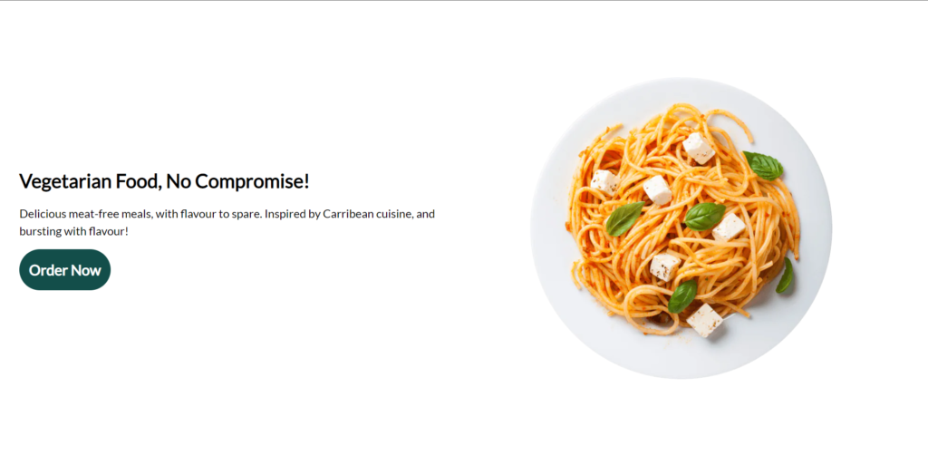
Thanks to a few CSS rules, we can easily translate between these two layouts and fill up the empty space we’ve gained. Here’s the changes applied by our media queries:
@media (min-width: 1024px) {
    .container {
        flex-direction: row-reverse;
        padding: 2rem;
    }

    .plate-container {
        width: 100%;
        padding: 2rem;
    }

    .text-container {
        justify-content: start;
        align-items: start;
        text-align: start;
    }
}
Our original CSS rules still apply, but with these rules being applied over them. I’ve used the min-width media query, which applies the rules if the screen size reaches the given width.
For the container, we increase the padding slightly and change the flex direction to horizontal, using up the space we gained from the width increase.
For the text, instead of centering this in the screen, we align it along the left instead of the centre.
This is a basic example of using media queries to change the layout of your app, but any CSS rule can be applied through media queries, whether its something like changing the direction your content flows in , changing the font size, or changing an image between breakpoints.
In React
I’ll share two custom hooks with you which I’ve found very useful in different scenarios.
Here’s our media queries that we’ll be using, using some defined breakpoints at common screen sizes. You can customise these to your liking, or omit them completely.
export const sizes = {
    sm: '640px',
    md: '768px',
    lg: '1024px',
    xl: '1280px',
    '2xl': '1536px',
};
We also have some helper functions, the first creates the media query through JavaScript, and the second is the pure JavaScript logic for our hook.
function isMatch(media) {
    const query = `(min-width: ${sizes[media]})`;
    return window.matchMedia(query).matches;
}

function findClosest(queries) {
    for (let i = queries.length - 1; i >= 0; i--) {
        if (isMatch(queries[i])) {
            return queries[i];
        }
    }
    return 'sm';
}
The hook below finds the media query that closest fits the current screen size. This can be useful for example changing an image depending on the screen size, if you take a look at the Squarespace landing page, you could use this to produce the framed video component in the first section.
export const useClosestMedia = () => {
    const [closest, setClosest] = useState('sm');

    useEffect(() => {
        const listener = () => setClosest(findClosest(queries));
        listener();
        window.addEventListener('resize', listener);
        return () => window.removeEventListener('resize', listener); //Cleanup
    }, []);

    return closest;
};
This is a simple custom hook that loops through the selected breakpoints to find the largest screen size that fits the current screen.
We set up a useEffect to recalculate this on resize, with a clean-up function to remove our listener on unmount.
Then we store the closest media query match using a useState hook, so our component re-renders whenever our media query changes.
Here’s another useful hook for media queries:
export const useMediaQuery = (screen) => {
    const [matches, setMatches] = useState(false);

    useEffect(() => {
        const query = `(min-width: ${sizes[screen]})`;
        const media = window.matchMedia(query);
        if (media.matches !== matches) {
            setMatches(media.matches);
        }
        const listener = () => setMatches(media.matches);
        window.addEventListener('resize', listener);
        return () => window.removeEventListener('resize', listener);
    }, [matches, screen]);

    return matches;
};
This hook is a simplified version of the first, it returns whether or not a media query fits the given size. This is closer to a regular CSS media query, i.e. if you want something to only happen above/below a certain breakpoint.
Now lets see both of them in action:
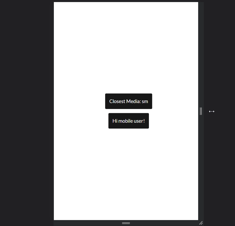
Our first hook updates to display the closest screen size, and our second updates when the screen passes the small screen size breakpoint.
One important thing to note is this is entirely achievable through CSS, the benefit is we use conditional rendering to avoid rendering the component altogether, which saves us a bit of performance.
Hopefully this has been a helpful introduction to media queries in React. If you liked this post, or if I haven’t covered everything you need, feel free to let me know in the comments below!
💬 Leave a comment