In this article, we are going to learn about Component Driven Development (CDD) alongside a workshop for UI merchants to go and make their bulletproof components. Fasten your seat belts and let’s drive straight into it. 💨💨
What And Why Component-Driven Development?
The development of user interfaces is first in a modular approach so that it is “bottom-up” in a manner that we progress from the basic components to the top. In CDD we
- Start with the basic components and build them in isolation, the idea is to start small.
- Then we take these small building blocks and compose components by combining them, here onwards the complexity goes up.
- Using these composite components we then make our pages.
- And these pages and screens are integrated into our application.
What Is Storybook?
Storybook is a front-end workshop/platform for developers to build their UI components and pages in isolation. It is open-source and used by many teams worldwide.
Configuring Storybook With ReactJS
Storybook comes with a one-liner command configuration
npx sb initOnce the command is executed you should see some new configurations and dependencies in your application directory. Including .storybook and stories.
In package.json we can see two new scripts alongside some new dev dependencies.
"scripts":{
...
 "storybook": "start-storybook -p 6006 -s public",
 "build-storybook": "build-storybook -s public"
}
"devDependencies": {
    "@storybook/addon-actions": "^6.5.12",
    "@storybook/addon-essentials": "^6.5.12",
    "@storybook/addon-interactions": "^6.5.12",
    "@storybook/addon-links": "^6.5.12",
    "@storybook/builder-webpack5": "^6.5.12",
    "@storybook/manager-webpack5": "^6.5.12",
    "@storybook/node-logger": "^6.5.12",
    "@storybook/preset-create-react-app": "^4.1.2",
    "@storybook/react": "^6.5.12",
    "@storybook/testing-library": "^0.0.13",
  }
Storybook does all of the hard work for you 😎🤓. All you have to do is start building components in your new workshop which has all the tools you need.
Sawing Our First Storybook Component 🪚🪵
Let’s create a basic component so that we can move on to the real magic of storybook
import React from "react";
import "./button.css";
export default function Button(props) {
  const { color, name, ...rest } = props;
  return (
    <button className={`button ${color}`} {...rest}>
      {name}
    </button>
  );
}
After creating our component we go under the stories directory to write our components story
import React from "react";
import Button from "./../components/Button/Button";
export default {
title: "My Button",
component: Button,
};
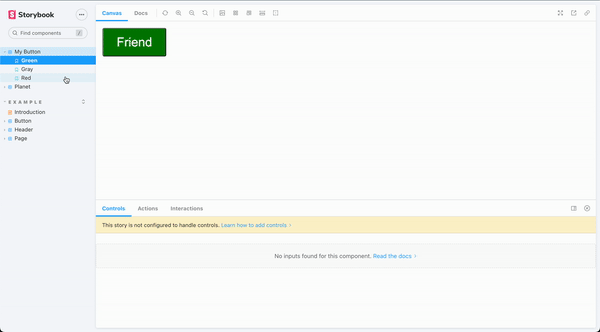
export const Green = () => <Button color="green" name="Friend" />;
export const Gray = () => <Button color="gray" name="acquaintance" />;
export const Red = () => <Button color="red" name="Enemy" />;
Our default exports are the actual component and the title we want to show once we put it on display in our workshop.
Once you are done with all of this you can go ahead and run your storybook using npm run storybook and visit at local port 6006.
BOBS YOUR UNCLE 🤓
STORYBOOK IS SO POWERFUL 🚀🚀🚀
Try Storybook With Our Components
Wrap Up
Let’s call it a day 🥱. Start using storybooks today and onwards! I cannot stress this enough. It is really going to help you out if you are either weak or strong at the development of the components. You can catch your mistakes early in the process and many complex components in no time. See you at the next one, this is not a goodbye.
💬 Leave a comment