Animating components on scroll is a great way to add a touch of interactivity to your web application. It can help you create engaging user experiences that make your application stand out. In this article, we will explore how to use Framer Motion to animate components on scroll in Next.js.
Set-Up
First of all, you’ll need to add Framer Motion to your Next.js project. This can be done with the following command:
npm install --save framer-motionWhich will install Framer Motion and all its dependencies.
Framer Motion
For a quick introduction, Framer Motion is a package that helps developers add animations and transitions to their web and mobile apps. It’s a popular library that uses simple syntax to create complex animations that are both engaging and fluid.
With Framer Motion, developers can create animations that move across the screen in response to user interactions, like clicks and swipes, with ease. The library offers a range of features, including physics-based animations, gesture recognition, and more. It’s a great option for developers who want to create dynamic animations without spending too much time on coding.
Scroll-Triggered Animations
I’m going to be splitting up scroll animations into two types, scroll-linked and scroll-triggered. With scroll-linked animations, we’ll be doing some kind of transformation based on how far scrolled the page is. Scroll-triggered on the other hand, we’ll be starting some animation once the element scrolls into view.
Framer Motion provides scroll-triggered animations through the whileInView prop. Simply put, whenever the element scrolls into view, Framer Motion will switch it to whatever style is provided in the whileInView prop.
The first step is to set up our variants for our animation, these are essentially the different styles we want Framer Motion to animate between. We’ll start off with something simple, just making our page title fade in from the left:
const introHeaderVariants: Variants = {
    hide: {
        opacity: 0,
        x: -500,
    },
    show: {
        opacity: 1,
        x: 0,
        transition: {
            duration: 2,
        },
    },
};
And we’ll add another set of variants to make our picture fade in from the opposite side:
const introPictureVariants: Variants = {
    hide: {
        opacity: 0,
        x: 500,
    },
    show: {
        opacity: 1,
        x: 0,
        transition: {
            duration: 2,
        },
    },
};
The next step is to add these variants to our component, and tell Framer Motion when to use them, by passing in some props:
export function Intro() {
    return (
        <div className="flex h-[36rem] w-full flex-col items-center justify-center overflow-x-clip bg-secondary text-light md:h-[90vh]">
            <NavBar />
            <main className="relative flex w-full grow items-start justify-center py-12 px-4 md:items-center md:justify-start md:px-12">
                <motion.header
                    className={clsx(
                        'z-10 flex flex-col gap-4 md:-mt-36',
                        title.className
                    )}
                    initial="hide"
                    whileInView="show"
                    exit="hide"
                    variants={introHeaderVariants}>
                    <h1 className="text-center text-5xl md:text-start md:text-8xl">
                        The Best Pet <br /> Groomers <br /> in Town
                    </h1>
                    <p className={clsx('text-3xl font-light', text.className)}>
                        For a pawfect look and feel!
                    </p>
                </motion.header>
                <motion.div
                    className="absolute right-0 -bottom-12 w-full sm:w-4/5 md:-bottom-36 md:w-[950px]"
                    initial="hide"
                    whileInView="show"
                    exit="hide"
                    variants={introPictureVariants}>
                    <Image src={pets} alt="Cat and dog" />
                </motion.div>
            </main>
        </div>
    );
}
You can ignore most of the code here, it’s just some simple elements, with some styling from TailwindCSS. The important part is this block:
                    initial="hide"
                    whileInView="show"
                    exit="hide"
                    variants={introHeaderVariants}
I’ve told Framer Motion to start off with the “hide” variant, then animate to “show” whenever the element is in view, and then back to “hide” whenever the element is off-screen.
With that, here’s the effect we get:

With just a few lines of code, we have a clean slide in animation!
Scroll-Linked Animation
Let’s set up a scroll-linked animation, and use this to add some parallax effects to the testimonials section of our site:
Here’s the updated component:
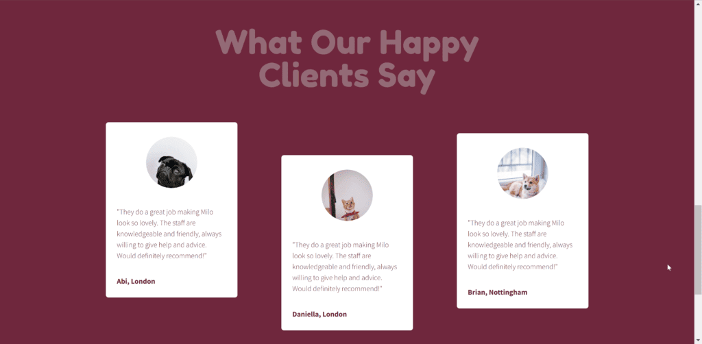
export function Testimonials() {
    const target = useRef(null);
    const { scrollYProgress } = useScroll({
        target,
        offset: ['start end', 'end start'],
    });
    const parallax = useTransform(scrollYProgress, [0, 1], [-100, 100]);
    const reverseParallax = useTransform(parallax, (v) => -v);
useMotionValueEvent(parallax, 'change', (v) => console.log(v));
return (
<div
className="flex min-h-[150vh] w-full flex-col items-center justify-center gap-12 bg-secondary px-4 py-24 md:p-24"
ref={target}>
<h2
className={clsx(
'text-center text-4xl text-primary md:w-1/2 md:text-7xl',
title.className
)}>
What Our Happy Clients Say
</h2>
<div className="flex grow flex-wrap items-center items-center justify-center justify-center gap-24">
<Testimonial className="md:mb-24" parallax={parallax}>
<TestimonialImage src={pet1} alt="" />
"They do a great job making Milo look so lovely. The
staff are knowledgeable and friendly, always willing to give
help and advice. Would definitely recommend!"
</Testimonial>
<Testimonial className="md:mt-12" parallax={reverseParallax}>
<TestimonialImage src={pet2} alt="" />
"They do a great job making Milo look so lovely. The
staff are knowledgeable and friendly, always willing to give
help and advice. Would definitely recommend!"
</Testimonial>
<Testimonial className="md:mb-12" parallax={parallax}>
<TestimonialImage src={pet3} alt="" />
"They do a great job making Milo look so lovely. The
staff are knowledgeable and friendly, always willing to give
help and advice. Would definitely recommend!"
</Testimonial>
</div>
</div>
);
}
But I’ll talk you through the code, step by step.
Firstly we need some way to track the scroll progress of our element. In our case, we want to know how far we are through the testimonials section. We can do this through the useScroll hook:
const target = useRef(null);
const { scrollYProgress } = useScroll({
target,
offset: ['start end', 'end start'],
});With no arguments, the hook just tracks how far along the page the user has scrolled. You can provide it with a ref, however, to make it track how far an element is along the viewport. Then we also have the offset option, which describes where your start and end points should be. In our case we want 0 to be when the start of our element is at the end of the viewport (i.e. just about to scroll onto screen), and we want 1 to be when the end of our container is at the start (fully off-screen) .
This give sus a value between 0 and 1, but we want to use this to offset where our testimonial cards are, and 1 pixel isn’t a lot. Framer Motion provides the useTransform hook for this, to scale our 0 to 1 to a more noticeable range:
const parallax = useTransform(scrollYProgress, [0, 1], [-100, 100]);
const reverseParallax = useTransform(parallax, (v) => -v);useTransform either takes an input and output range, or a function to use to transform the value. I’m using both, the first one to scale the scroll progress to some larger values, and the second to make one of the cards move in the opposite direction.
Then we pass these values to our Testimonial cards as props. Inside the component, they’re used inside the style prop:
function Testimonial({ className, children, parallax }: TestimonialProps) {
    ...
    return (
        <motion.div
            className={clsx(
                'text-md flex aspect-[3/4] h-96 flex-col items-center justify-between gap-8 rounded-md bg-white p-6 font-light text-secondary shadow',
                className
            )}
            style={{ y: parallax }}>
            {children}
            <div className="w-full text-start font-bold">
                {randomName}, {randomLocation}
            </div>
        </motion.div>
    );
}
And here’s the effect we get:

Conclusion
And that’s all, thanks for reading! I hope you were able to use these examples to get set up with scroll animations in Next.js. If you want some further reading on Framer Motion, why not check out this article. Feel free to take a look at the full code here and play around with it. If you liked this article, leave a comment below!
💬 Leave a comment