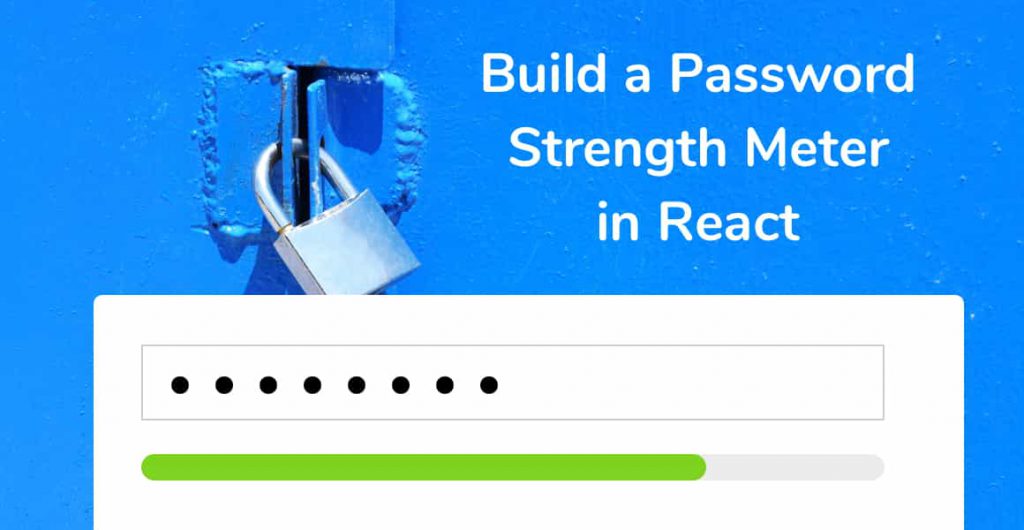
In today’s tutorial, we will build a password strength meter in React using the zxcvbn password strength estimation library. Read on to get started!
What We’re Building
Try the live version of our Password Strength Meter in React.
You’ve all seen password strength meters before on app sign-up pages, hovering underneath the password input field. So, what’s their purpose?
A password strength meter’s purpose is to give the user visual feedback as to how strong their password is as they’re typing it out. Password strength meters are a vital aspect in securing your modern web app. Without it, your users will probably use ‘hello123’ as their password, or even worse, ‘password’.
So, let’s get started!
Creating a New React App
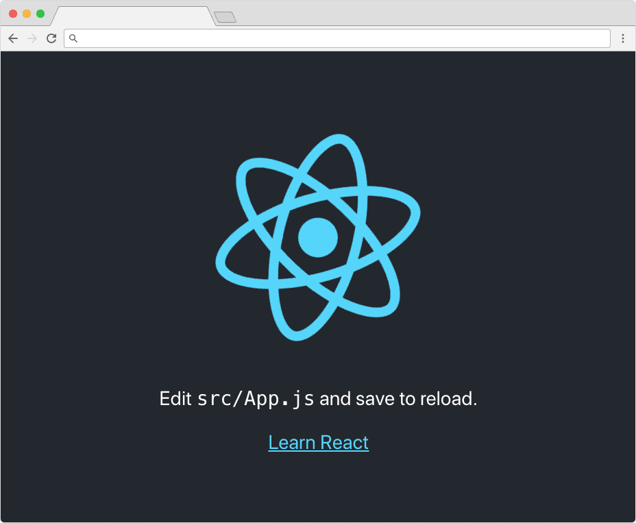
As always, let’s create a new React app using Create React App. If you don’t know what this is, head on over to the Create React App Github repository page and follow the instructions for setting up a new React project. Come back here when you have the base app up and running.
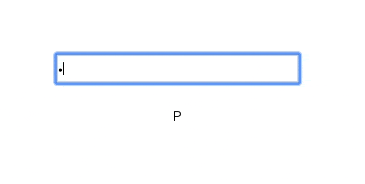
It should look something like this:
Installing the ZXCVBN Library
The password strength estimation library, Zxcvbn, takes a single string (the password) and returns an object with a number of useful options related to the strength of that string. Dropbox uses zxcvbn on their web, mobile, and desktop apps.
To pass a string to the zxcvbn library, we can simply do the following:
zxcvbn('hello');Navigate to the root of your new React project, open a terminal window and run the following command to install zxcvbn.
npm install zxcvbnOnce that’s finished installing, open up the codebase in your favorite editor (ours is Atom, hence why we created a list of our best Atom packages for front-end developers)
Creating the Base Password Strength Meter Component
Create a new JavaScript file in our root directory named PasswordStrengthMeter.js. This will be our new React class component.
Remember to use title casing for the file and component name whenever you create a new React component. It’s a standard naming convention in React!
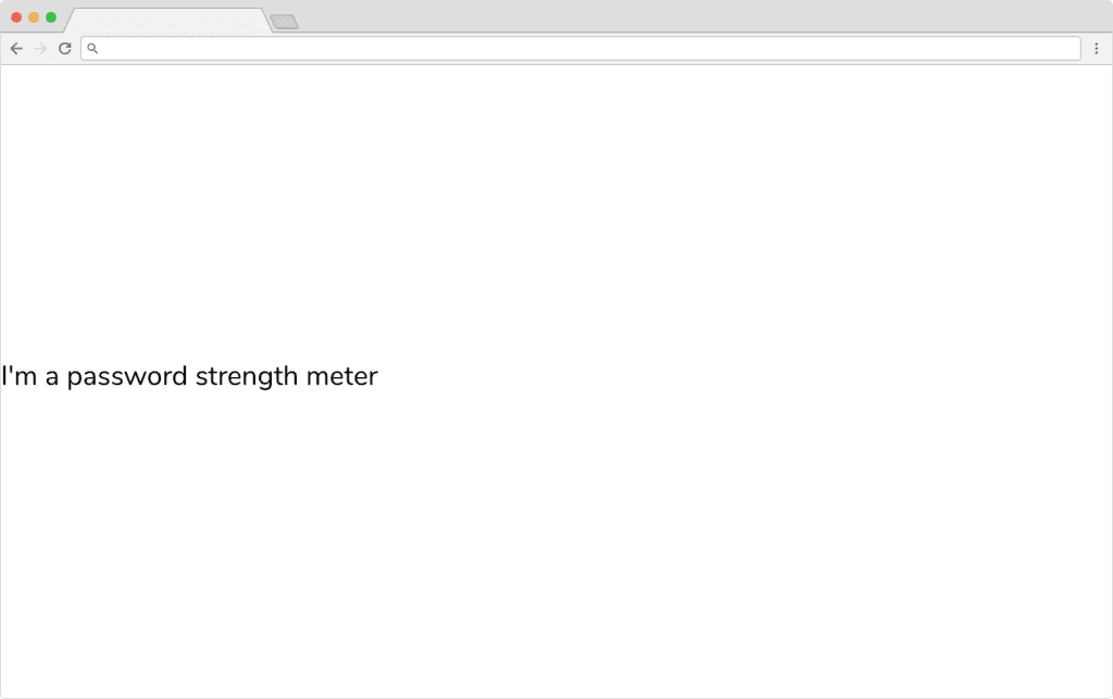
We want our new password strength meter react component to be a class component, so go ahead and open PasswordStrengthMeter.js and add the following code:
import React, { Component } from 'react';
import './PasswordStrengthMeter.css';

class PasswordStrengthMeter extends Component {
  render() {
    return (
      <div className="password-strength-meter">
        I'm a password strength meter
      </div>
    );
  }
}

export default PasswordStrengthMeter;
Let’s step through the code above:
- We’re importing React and the named export Component from the react library. This means we can create a React class component.
- We’re importing the .css file ./PasswordStrengthMeter.css which contains all of our styling for our component.
- Finally, we’re defining a new class named PasswordStrengthMeter which has one method, render. This is rendering a single div with some text, just to show to us that the component is working.
Save your PasswordStrengthMeter.js, and open up App.js. This is always the example component created for us whenever a fresh Create React App has finished running for the first time.
Inside App.js, import our PasswordStrengthMeter component at the top of the file alongside the other import statements. Finally, insert the <PasswordStrengthMeter /> component tag inside the render method of App.js.
App.js
import React, { Component } from 'react';
import PasswordStrengthMeter from './PasswordStrengthMeter';
class App extends Component {
  constructor() {
    super();
  }

  render() {
    return (
      <div className="App">
        <PasswordStrengthMeter />
      </div>
    );
  }
}

export default App;
Save the file, jump back to your browser and your React app should look like this:
Passing the Password to the Strength Meter Component
Great! We’ve got a working component that’s being rendered in our App.js component.
Before we move on, let’s stop and think about how we want to architect the password strength meter react component. I’ve seen other password strength meter libraries that are both an input element AND a password strength meter.
This is a bad approach, for two reasons:
- You’re creating a dependency between the input field and the strength meter.
- You’re not making your component flexible. What if we wanted to use another type of input element to enter our password? We couldn’t.
Those two points are similar, but I hope you understand what I’m getting at. Basically, let’s just create the strength meter not the input field.
That means that we need to pass a password string to our PasswordStrengthMeter component for it to know what to run through zxcvbn. We’ll do this using props.
Inside App.js, add an input element and have it so that onChange, it sets the password state property to whatever the value that’s being typed into the input:
import React, { Component } from 'react';
import PasswordStrengthMeter from './PasswordStrengthMeter';
class App extends Component {
  constructor() {
    super();
    this.state = {
      password: '',
    }
  }

  render() {
    const { password } = this.state;
    return (
      <div className="App">
        <div className="meter">
          <input autoComplete="off" type="password" onChange={e => this.setState({ password: e.target.value })} />
          <PasswordStrengthMeter password={password} />
        </div>
      </div>
    );
  }
}

export default App;
We do a couple of things above:
- Give our component state, with a property called password.
- Add an input element of type password, and attach an onChange handler to it which sets the state to whatever the value is.
- Pass the password property from our state to the <PasswordStrengthMeter /> component through a prop called password.
Getting a Result from ZXCVBN
Before you save and jump back over to your browser, we need to test that we’re getting the password in our PasswordStrengthMeter component.
I’m a big fan of destructuring props and state. Destructuring allows you to refer to prop and state values without having to write this.props.value or this.state.value every time.
const { value, value2, value3 } = this.props;
const { value } = this.state;
Add the following code to the render method of PasswordStrengthMeter.js:
render() {
const { password } = this.props;
return (
<div className="password-strength-meter">
<br />
<label
className="password-strength-meter-label"
>
{password}
</label>
</div>
);
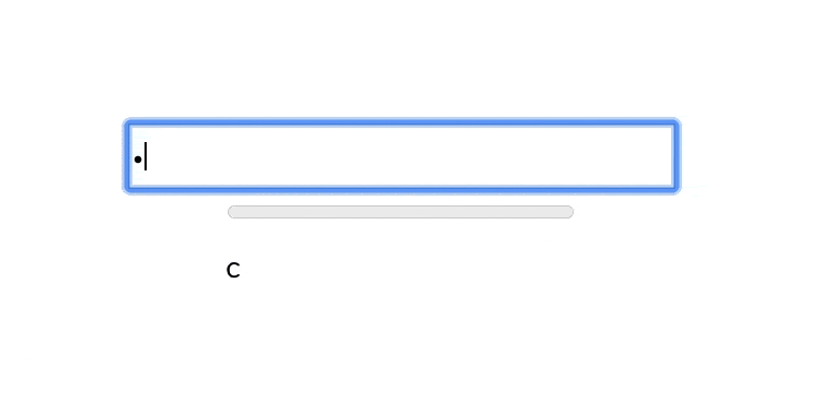
}Save the component, jump over to your browser and you should now see whatever you’re typing into the input element below:
This isn’t a great password strength meter. In fact, it’s the opposite of one right now This is where zxcvbn comes in.
In order to evaluate the password coming from the input element, we need to pass our password string prop to the zxcvbn library. This will return an object with a key named score. Score is an integer between 0 and 4:
result.score      # Integer from 0-4 (useful for implementing a strength bar)

  0 # too guessable: risky password. (guesses < 10^3)

  1 # very guessable: protection from throttled online attacks. (guesses < 10^6)

  2 # somewhat guessable: protection from unthrottled online attacks. (guesses < 10^8)

  3 # safely unguessable: moderate protection from offline slow-hash scenario. (guesses < 10^10)

  4 # very unguessable: strong protection from offline slow-hash scenario. (guesses >= 10^10)
Create a new constant called testedResult and assign it to the value of zxcvbn being passed the password string.
  ...
  render() {
    const { password } = this.props;
    const testedResult = zxcvbn(password);
    return (
      <div className="password-strength-meter">
        <label
          className="password-strength-meter-label"
        >
          {password}
        </label>
      </div>
    );
  }
  ...
Adding a Progress Element
We’re almost there, but missing one crucial element: the strength meter itself!
The progress HTML element is the perfect use for this. It takes two attributes: value and max.
Insert a new Progress HTML element above the label and pass testedResult.score into the value attribute, and 4 into the max attribute. We’re passing 4 because that’s the highest value returned from the zxcvbn library, so the progress element will be out of 4.
  ...

  render() {
    const { password } = this.props;
    const testedResult = zxcvbn(password);
    return (
      <div className="password-strength-meter">
        <progress
          value={testedResult.score}
          max="4"
        />
        <br />
        <label
          className="password-strength-meter-label"
        >
          {password}
        </label>
      </div>
    );
  }

  ...
Save the file, jump back to your browser and type a password into the input field. Watch the progress bar fill as you type!
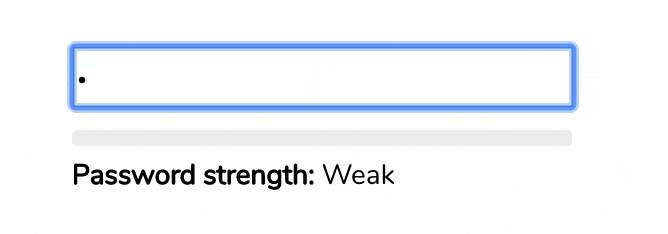
Adding a Better Label
We’re almost at the finish line. Technically, our Password Strength Meter in React is working, but it could be better. We don’t want to display the actual password that’s being typed. Instead, let’s show a handy label telling the user how strong their password is.
To do this, create a new class method inside the component called createPasswordLabel, that takes a single integer parameter, the score, and returns a string, our interpretation of that score (weak, fair, good, etc)
...

  createPasswordLabel = (result) => {
    switch (result.score) {
      case 0:
        return 'Weak';
      case 1:
        return 'Weak';
      case 2:
        return 'Fair';
      case 3:
        return 'Good';
      case 4:
        return 'Strong';
      default:
        return 'Weak';
    }
  }

  ...
This makes the Password Strength Meter a little more human-friendly (so we get top marks for UX).
Finally, modify the render method so that we’re calling this new method:
render() {
const { password } = this.props;
const testedResult = zxcvbn(password);
return (
<div className="password-strength-meter">
<progress
value={testedResult.score}
max="4"
/>
<br />
<label
className="password-strength-meter-label"
>
{password && (
<>
<strong>Password strength:</strong> {this.createPasswordLabel(testedResult)}
</>
)}
</label>
</div>
);
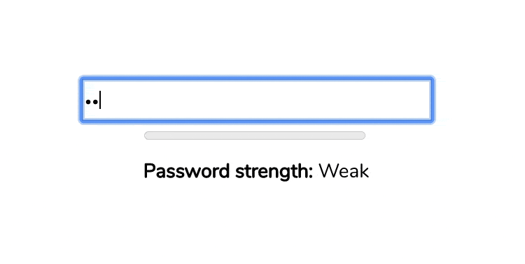
}Save the component, hop back to your browser, type a password and watch what happens:
Styling our Password Strength Meter
I’m a big fan of focusing on the user experience when it comes to creating React components. Our Password Strength Meter is good, but adding some color would really improve the user experience.
Let’s change the color of the progress meter by applying a CSS class to the progress element depending on the return value of the createPasswordLabel method.
...

  <progress
    className={`password-strength-meter-progress strength-${this.createPasswordLabel(testedResult)}`}
    value={testedResult.score}
    max="4"
  />

...
Save the component, and create a new file in the same directory called PasswordStrengthMeter.css. Add the following CSS to it:
.password-strength-meter {
  text-align: left;
}

.password-strength-meter-progress {
  -webkit-appearance: none;
  appearance: none;
  width: 250px;
  height: 8px;
}

.password-strength-meter-progress::-webkit-progress-bar {
  background-color: #eee;
  border-radius: 3px;
}

.password-strength-meter-label {
  font-size: 14px;
}

.password-strength-meter-progress::-webkit-progress-value {
  border-radius: 2px;
  background-size: 35px 20px, 100% 100%, 100% 100%;
}

.strength-Weak::-webkit-progress-value {
  background-color: #F25F5C;
}
.strength-Fair::-webkit-progress-value {
  background-color: #FFE066;
}
.strength-Good::-webkit-progress-value {
  background-color: #247BA0;
}
.strength-Strong::-webkit-progress-value {
  background-color: #70C1B3;
}
Save, jump back to your browser and enter in a password. You’ll now see a colorful, user-friendly password strength meter.
Wrapping Up
Well, that’s it. I hope you’ve enjoyed following this tutorial to build a password strength meter in react as much as I’ve enjoyed writing it.
The full source code can be found over on the Upmostly Github repository for this project.
As always, leave a comment if you have any questions, issues, or just straight up enjoyed coding this. See you next time!
You may be interested in our other project based tutorials like How to Build a Switch Toggle Component and Build a Todo App in React Using Hooks.
💬 Leave a comment